The other day I was in the middle of discussion about visuals a team was going to use in a new project. When we came to the point of tracking completion of the project I advised a burn-up chart and intended to move on. The thing that stopped me was the question I was asked: why burn-up and not burn-down?
Burn-down Chart
First, some basics. Burn-down chart is an old idea I’ve learnt from Scrum. It is a simple graph showing amount of work on a vertical and timeline on a horizontal axis. As time progresses we keep track how much work is still not done. The goal is to hit the ground. The steepness of the curve can help us approximate when it’s going to happen or, in other words, when we’re going to be done with the whole work.
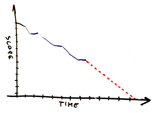
When we think about quantifying work it should be anything we use anyway – story points, weighted T-shirt sizes, simple number of tasks or what have you.
Burn-up Chart
Burn-up chart’s mechanics is basically the same. The only difference is that instead of tracking how much work is left to be done, we track how much work we’ve completed, so the curve is going up, not down.
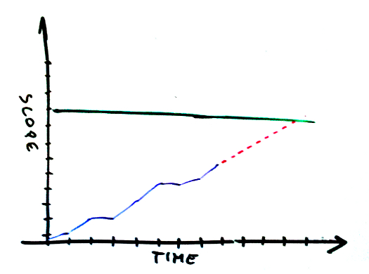
The Difference
OK, considering these two work almost identically, what’s the difference? Personally, I don’t buy all the crap like “associations of the word burn-down are bad.” We learned not to be afraid of failure and we can’t deal with a simple word? Give me a break.
The real difference is visible when the scope changes. If we suddenly realize we have more work to do burn-down may look like this.
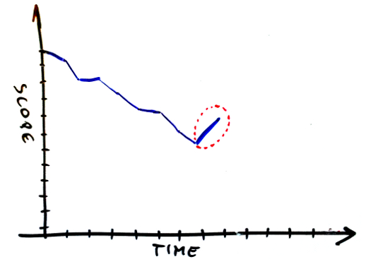
Unfortunately, it can also look differently if we happen to be (un)lucky enough to complete some work at the same time when we learn about additional work.
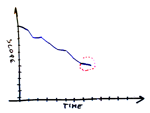
It becomes even trickier when the scope decreases.
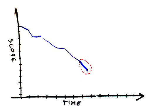
Have we just completed something or has a client cancelled that feature which we talked about yesterday? Not to mention that approximating the finish of work becomes more difficult.
At the same time, burn-up chart makes it all perfectly visible as progress is tracked independently on scope change.
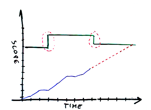
You can see scope changes in both directions, as well as real progress. And this is exactly why choosing burn-up over burn-down should be no brainer.
 Subscribe RSS feed

Used both.
As long as they are on the wall, and the business owners (the Adders Of Scope) are physically present, there /seems/ to be reluctance to change scope. Zero is zero. Now, if we just build forever upward, what’s the harm in Just One More Feature…
Also, I hear, some psychology about completion satisfaction. Up (goal lines notwithstanding) is ever upward, and the work will never be done. Down to zero is an achievable goal.
@Steven – Reaction to adding Just One More Feature is pretty simple. Basing on your approximated future curve you can instantly say how much time it costs to add it.
Then, there is the goal. With burn-down the goal is crossing the x axis. In burn-up it is crossing scope line. You don’t go till the infinity.
And when you are on psychology, I know (close to) nothing about that, but I bet you will find evidence than going up with the curve gives you more satisfaction than going down. Not that I treat it as a real argument in this discussion — it is exactly the part of the dispute that I don’t buy.
Burning down focuses on work remaining while burning up emphasises on performance. My personal preference is work remaining as thus the team stays aware of scope changes and is likely to advise against it while focusing on performance encourages the thinking that it’s alright to taken on more work as long as we keep doing X work per work.
Thanks for the entry as I am really interested in this up vs down article because it keeps coming back in team discussions. What are you tracking on the vertical, Story points estimated and story points completed? If so, I get it but I find it more useful for release (over several sprints) than sprint themselves.
I my case we only take a few stories into our sprint hence the above does not tell much during the sprint.
We tend to break down our stories into tasks and those get estimated in ideal days, then burn down that remaining effort required. Using this vertical scale I find the burn down more useful, particularly if you also display No of story not done/Total No of story against the same time axis. the combination give a good indicator of scope increase/decrease and progress.
PS: Could send you a sketch if this is not clear ;-)
Hi Pawel,
thanks for your post.
In our team we handle the change of scope the same way, but in the burn down chart. It is also possible to move the x-axis further down as the scope is increased. This way your performance keeps visual and motivating. :-)
I would say both techniques are good ways.
regards
Benjamin Peter
Great article. I prefer burnups as well for the same reasons
AND
With burnups you are better prepared for the upgrade to cumulative flow diagrams…
I am a big fan of the burn-up as well!
I have considered using an “enhanced burndown chart”, which would help showing the increase of scope… but never invested the time to actually do it :-)
https://www.google.com/search?q=%22enhanced%20burndown%20chart%22
@Anton – With burn-up you can focus on both as you have two horizontal lines – x axis and scope line. Adding something to the scope clearly shifts planned date, thus you have clear information that it doesn’t come for free.
@Thierry – Actually I haven’t exactly said what you track on y axis as it depends on context. In a situation similar to yours, where we split features (Minimal Marketable Features) into smaller tasks (we called these simply development tasks) we tracked just a number of development tasks completed. We didn’t have fixed-length iterations but there were as few as three or four features per release so it didn’t make sense to track it. At the same time we had about 5 or 6 development tasks per feature on average so we could track 15-25 separate items within the scope.
We could also use hour estimates for these development tasks, as we had them for some time, but decided to go with a simpler method.
In your case you can burn (up) your tasks either simply counting them or using ideal days.
By the way: if you have a method of scope accounting which makes sense in terms burn-down chart, simply use the same method for burn-up chart. This way you can have additional information as you go from iteration to iteration, which is how you learn about the scope. I expect that at the beginning of timebox you “design” user stories splitting them into tasks and making estimates in ideal days. Once you’re done with it you can change the scope line in burn-up chart showing that now you know another chunk of work to be done.
Then eventually you may think about decoupling planning with timeboxes and doing it on-demand — whenever there’s free capability to build another story. But that’s a longer discussion.
Pawel,
Great post! My own personal preference is to use a sprint burn-down chart and a release burn-up chart. Anton hit the nail on the head for me, burning down focuses on the work remaining – great for teams managing their work/throughput at a sprint level – while a release burn-up chart shows definitive upward progress towards a longer-term objective (the release).
Hello Pawel,
How about using release burndown bar chart? You could read more about this on Mike Cohn blog. I feel it provides great insight on when release is going to be done by tracking scope changes and current progress. http://www.mountaingoatsoftware.com/scrum/alt-releaseburndown
What are your thoughts?
Thanks,
Avie
@Avienaash – Alternative burndown chart does the job so I’d say it’s definitely better than standard burndown. In terms of my personal approach I prefer burnup at it appeals to me more.
As Yuval points in one of earlier comments burnup is a nice starting point to Cumulative Flow Diagram which gives you more information than simply burndown/burnup. Anyway given only the basic goals either design should work well.
The two are functionally equivalent; you can raise the ceiling or lower the floor on a scope change; Mike Cohn’s blog illustrates this well.
Hey Pawel,
There are some good insights here, even though I believe your view is a bit biased :-) my take is simple:
1) when your need is to track the completion of a defined fixed scope, within a defined fixed time, the Burndown chart is the tool which has been designed for that. This is what a Scrum team might use to track progress in a Sprint, where they have a defined scope (what they pulled at the planning meeting) and a fixed time;
2) when your need is to track progressive trends and make forecast about future release content or delivery date, then the Burnup charts are better suited. I do not have an upper limit set and starting from 0 (zero) you start adding up stories (or value, or whatever else) and monitor trends. On the long terms is very useful for product owners to have constructive and transparent conversations with stakeholders, about what might be released by when, or when a certain scope might be completed.
My point is simple, like practices, also tools have a meaning depending on the context, and I think saying one is better than the other, without providing alternative contexts is somehow unfair :-)
Great idea, well explained. Thank you!
Pawel, great info. thanks!
You touched on something that I have been tryong to figure out, could you please point me in the right direction.
– I wondered how can you can quantify scope if all User Stories are not estimated and also not broken down into tasks at the start of a project (usually we to do this for one or two Sprints at a time to get going soonest).
– You mentioned you can work what “what you have” but could you please give me some ideas of what you use ? Do you estimate / break down tasks for all Stories at the start of a project?
Hi Floris,
To size the scope of a project we use simply a feature count. Can be a user story count too if you are attached to user stories. In my experience in the long run it provides the same quality of data and doesn’t require any sizing / planning activity and thus is a pure tame saver.
Here’s another report of the same observation.
You can find a rationale behind the observation in this on estimation and there’s also another take here. All valid.
Sizing then is a non-issue. How do we deal with uncertainty related to the fact that we don’t necessarily split epics to atomic features for the whole project? That’s simple. What we need to know is roughly how many features we’d end up building.
From that perspective we could have done all the analysis up front, split all the epics into features and it wouldn’t give us an answer. It is so simply because the scope will be changing over the project course. We will realize that we forgot something and we unnecessarily added something else. We will learn that we underestimated complexity of some features and we’ll end up splitting them into smaller chunks mid-project. We will discuss the scope with a client and make tweaks in a backlog to maximize value we provide. Long story short, even if we had a perfect count at the beginning of the project it is a subject to change.
That’s why precision is not a goal here. We want to know roughly how many features will be there. So looking at an epic we very briefly think what features we can envision while building it.
Let me give you an example. Think of administering users in a product as an epic. When I look at it in a given context I can think: sign up, login and logout, user account, different roles of users, complicated additional data for user profile, complex security logic. This makes it 6ish features and it took me probably 30 seconds. I move on to another epic.
Once this is done I have a number, say 73, that looks precise but isn’t. This is why I’d think of the project scope as a range, say 65-90 features. For this step I can use historical data from the projects that we ended up building: how many features we ended up building versus how many features we expected to build. This gives me some guidance how too hook the range to the initial number I’ve got. I could even go as far to actually run Monte Carlo simulations on historical data but in practice we don’t do that.
By the way: if we combine uncertainty of the scope size with uncertainty yielded by our forecasting technique (Monte Carlo-based simulation) we typically end up with a pretty broad range both in terms of estimated cost and time. But that’s exactly the thing that we face: there is a lot of uncertainty in what we do and our estimates only reflect that.
I hope that helps.
Hi Pawel,
Thank you very much for explaining this so well – and opening my mind to new ideas – it really helps. A breath of fresh air and practical!
Cheers,
Floris
Although I haven’t tried this yet, but I feel we should stick to using burn-down charts for the sprint backlog given scope is rarely meant to change during the sprint.
A burn-up chart will make sense across the project for the product backlog.
Obviously, if you are using Kanban, then a burn-up chart makes better sense.
What do you think?
Whether burn up or burn down, both of these are happening with the confines of the sprint. Either way, it’s not so much about whether the graph crosses the X-axis or a horizontal scope line above, but rather if the pace of work is on track to get to one or the other horizontal line at or before you run into the right-side of the graph.
Hit submit too soon. I wanted to add it has to be a major emergency to adjust scope during the sprint.
Great article!