
- 2001: The internet bubble burst. The Startup ecosystem realized that companies actually have to make money to survive. Who could have thought, right?
- 2006: The rise of social media. The software industry figured out that social connections are essential for human beings. What a surprise!
- 2025: AI startups are nowhere near profitability despite unprecedented funding levels. Popular applications of AI products isolate us from social connections (anyone tried customer support recently?).
A lot of what’s happening in the IT industry feels like we’ve been reinventing the core principles that the rest of the world has already figured out. Like, centuries ago.
Small Business versus AI Startup
Do you know of a restaurant that’s been losing money for an entire first decade of its operations, and yet remained open? Or any small business in such a situation?
Unlikely. If you do, it’s probably a hobby business of someone sufficiently rich not to treat it as an actual company.
So how about, say, OpenAI? For the first decade, it didn’t show a single dollar of profit. It raised close to $60B. Recent reports suggest that they burned through most of that money. And it’s not like profitability is around the corner. Sam Altman mentioned profitability in 2029 or 2030, which many experts question as doubtful. Not to mention recent hints about bracing for a hypothetical bailout.
It’s as if your corner restaurant were bleeding 6-digits a month, and somehow still operated because the chef had plenty of charisma. Oh, and once the charisma eventually wears off, the mayor would definitely buy out the failing business, right?
If the restaurant scenario sounds absurd, that’s because it should. In the tech industry, we are indeed that far from any sensible business principles.
Tech Startup versus AI Tech Startup
One could argue it’s always been so. VCs were always a rogue player, actively devastating the rules of the game for startups (for their own gain and startups’ detriment).
However, save for the internet bubble, investors’ expectations were at least somewhat connected with what an old-school, boring, brick-and-mortar business had to endure.
As a context:
- Google was profitable in the year 3.
- Facebook, which started with no monetization plan whatsoever, generated profit in year 6.
All that in a super-privileged IT industry, which provides a ton of leeway.
Compare that with (optimistically speculative) 15 years for OpenAI.
Again, as a context:
- Google raised around $36M.
- Facebook, with its super-aggressive pre-IPO global expansion, raised around $2.3B.
Compare that with close to $60B for OpenAI (and nowhere close to the end of funding rounds).
And we aren’t comparing it to your corner restaurant anymore but to similar giga-unicorns. If the comparison seems absurd, that’s because it should.
AI in the Corporate World
Of course, the explanation is the expected growth trajectory. “Once these companies start making money, it will be unprecedented,” they say.
OK, I’ll bite. Let’s assume I believe in the growth plans. A valid question, then, is: Where will these new revenues come from?
Interestingly, the corporate world, despite enthusiasm, sees 95% of AI initiatives failing to generate return on investment. And while corporate coffers are semi-infinite, we shouldn’t expect much recklessness on the old-school CFOs’ account (they’re old-school after all, they believe in the ancient principle that the business should actually make money). If there’s little to show for it, the investments will remain limited.
Sure, no one wants to be a laggard. Toe-deep AI attempts will keep happening. It’s just not something that could serve as a vehicle to bring hundreds of billions in revenue to AI companies.
AI in Software Development
Obviously, AI is all the rage in software development.
You’d see vibe-coding companies dubbed as the fastest-growing startups ever. As impressive as the revenue trajectory is, I challenge the notion that these businesses are healthy or sustainable.

You’d see product companies reporting a dramatic increase in ARR per employee (Annual Recurring Revenue per full-time employee) thanks to AI.
Shopify, which says “reflexive AI usage is now a baseline expectation”, has seen the figure explode to $1.3M ARR per employee. Jason Lemkin from SaaStr pointed out that the company has 30% fewer employees compared to 2022 yet is generating double the revenue. (My quick math indicates ARR per employee tripled during that period.)
Kyle Poyar
In reality, it has little to do with AI. Shopify fired around 30% of its employees in 2022 and 2023, a painful adjustment following blatant overrecruitment during COVID. The layoffs were way before they could deliver anything AI or show the actual impact of AI-augmented development on their productivity.
In fact, Tobias Lütke announced that AI is a baseline requirement for Shopify employees only this year. Saying that it’s AI that’s behind the layoffs and, consequently, improved revenues per employee is making stuff up retroactively (a.k.a. bullshit).
That’s a common strategy, by the way. It allows dodging the responsibility for wild overhiring and then letting people go as a result. Now, the tech bros say, “It’s not us that lay you off; it’s AI.”

While AI adoption in software development is definitely a success story, it won’t be the growth engine that enables AI companies to achieve profitability. Not single-handedly.
AI in Customer Support
How about customer support then? Automating customer support seems like a slam-dunk AI application.
Klarna reportedly was able to fire 40% of its workforce as they replaced humans in customer support with AI bots. Except two years down the line, they realized how much their customer support sucked and made an attempt to rehire many of the specialists they’d axed. With very limited success, let me add. Karma is a bitch.
It sure looks good in a spreadsheet when you show short-term savings from firing a bunch of customer support consultants. In the long run, it’s a downward spiral of deteriorating customer satisfaction, increased stress for employees who remain, and attrition (of both customers and customer support representatives).
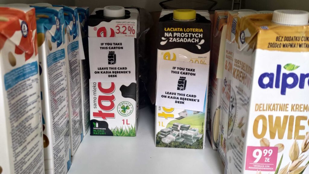
My recent experience with Spotify’s support (see below) is a case in point. To add insult to injury, the way they handle feedback tells me that they don’t give a damn.

But who am I trying to convince? Just recall your most recent interactions with AI customer support. How was it? Did you feel cared for?
As much as AI in customer support is here to stay, as it’s essentially IVR 2.0, we will “love” it just about as much as we love IVRs. We’ll still crave contact with a competent human on the other side who genuinely wants to help.
It will stay so, even if the machine could have solved the problem equally well (which it cannot because it doesn’t think). You know why?
Because we’re wired for connection.
Customer support is probably the most vivid example, but the observation applies anywhere where we aim to substitute human interactions with AI. Sure, we’ll keep trying, but the results will remain varied at best, awful at worst.
We simply won’t rewire our brains to stop looking for human connection. Not fast enough.
AI in Content Generation
How about content generation, then? We can now generate text, pictures, videos, and music, all of which, with a little bit of luck, can pass as human-created.
We already have AI-generated music to land (reportedly) a $3M deal. A quick trip to LinkedIn will drown you in AI-generated posts. I’m afraid even to look at other social media.
Here’s a thing, though. Even if all of that stuff was good, there’s no way to consume it all.
We can have 100x as many posts, Instagrams, YouTube videos, LinkedIn posts, and what have you. We still have only 1x as much attention. The day still has only 24h.

That, by the way, applies as much to products. Even if it were possible to vibe-code all these hypothetical new apps (it is not), it’s not like we’d have 100x as many potential customers. It’s not that we have 100x as much time to use these products either.
That, by definition, creates a ceiling on how much stuff we can sustainably generate and still make money from.
If we go further, we’ll create tons of AI slop and make entire spaces toxic. Think of social media flooded with reels of guardian dogs. For a short while, it will generate some good ad money, but then we will move on, understanding that none of this is authentic.
A resume-based hiring process is another good example. This time, it is a process that we actively need (unlike watching a non-existent hero dog). And yet, by now, I genuinely dread the idea of publishing a job ad. Just imagine tons of AI-generated applications coming from random people all over the world. We’ll probably rely on trust networks to circumvent that.
While we will see a lot of AI usage in content creation, it won’t lead to an exponential growth engine for AI tools. Simply because wherever it’s extensively used, it leaves a toxic landscape behind. That’s the direct opposite of sustainability.
A Non-Obvious Answer to Why the AI Bubble Will Burst
I started the post by mentioning how IT has learned the lessons that businesses need to make money, and that social connection is essential.
If we look at AI (as a business) through these lenses, the picture we see has to be grim. The sheer scale of the revenues AI businesses need to generate to defend absurd valuations doesn’t seem justifiable with current usage patterns.
AI adoption in many areas (content creation, customer support, etc.) goes against the basic human needs. They strip us of human connection. Thus, it is not sustainable.
The adoption in some other areas, like software development, even if more reliable in business terms, will not be enough to justify the bets everyone is making on generative AI.
So, here’s a non-obvious take on AI.
Because the AI business model relies on reducing social connections between human beings, it is not sustainable. Thus, there is the AI bubble, and it will burst.
That doesn’t mean LLMs don’t make sense or that none of the AI companies will make money (some AI startups already are profitable). It simply means that the industry as a whole is overheated. And since the only way forward for so many incumbents is to get heated even more (i.e., get even more money and burn it even faster), it can’t last.
Millennia of human social wiring tell me as much.