Category: project management

  • Options, Options, Options

    I think the first time I’ve heard that we should consider that a project backlog is simply a set of (unexercised) options it’s been from Ellen Gottesdiener It took me some time though to translate this, otherwise attractive, concept to something more down-to-earth in my own context. The catalyst in this case was one of Kanban Leadership Retreat sessions that covered portfolio management.

    Let’s imagine a company working on multiple projects. The organization size may vary, but let’s make it at least a couple hundred people strong. Such a company would have a bunch of project in progress but will also continuously work on selling more work to keep the business running.

    Every now and then, one of ongoing projects will get finished. What typically happens then is the company has some free capabilities. At the same time sales department is busy closing the deals. If the organization is extremely lucky and we are living in a fairy tale the pace of project completion will be exactly equal to the pace of new project arrivals.

    I have bad news though. We don’t live in a fairly tell. It’s even worse – most of the time we are not extremely lucky either.

    What typically happens is one of two things: there either are some free capabilities and no work that can fill this gap or the opposite – there is more work that should be started than can be handled with available capabilities. In fact, the situation dynamically changes from one to the other and back again.

    I want to focus here on a scenario with more incoming work that can naturally be absorbed by the org.

    One, sadly very common, approach is taking whatever comes from sales funnel and then pushing hard to make it fit, no matter what available capabilities are. Guess what – wishful thinking that people would handle more concurrent work doesn’t work at all. Conversely it only makes the problem worse as it forces teams to multitask which never comes for free.

    We can do better, can’t we?

    The opposite approach would be taking available capabilities into account and committing only to whatever the organization can handle. In other words it means saying no to some of available projects.

    It is like treating every incoming project not as a commitment by default but as an option. Well, it seems we have options again.

    So let’s picture our portfolio backlog as a bunch of options.

    Options

    Now, what happens when we start a project? Let’s keep it consistent with the Ellen’s concept. We fill the project backlog with a number of options. Except this time the options are more fine-grained. We may build these features or those features. Well, odds are we will build them all eventually, but the order is kind of important here.

    By the way, I’m yet to see a project where the scope doesn’t change. This basically means that every time we decide to build a feature we exercise an option of building this very feature while keeping the options of building other features still open.

    The option backlog will get replenished on occasions while we discover more and more details of the project. It will live and evolve the same way as our portfolio option backlog is alive and changing.

    The interesting part here is that commitment on one level (launching a project) springs a bunch of new options on another level (features or stories).

    Options

    In fact we can take this model even further. Once we as a team commit to build a feature we generate a bunch of options to build the feature in this or that way. We have an option to write tests. We have an option to write tests before the code. We have an option to write acceptance tests. We have an option to review code and so on. At the same we also have options to implement the feature in a few different ways functionality-wise. Some of them will be mutually exclusive, some of them won’t.

    Basically, starting work on a feature springs a handful of options on yet another level of granularity.

    Options

    If you imagine that building stuff in the company is happening on a few different levels – each of them dealing with more fine-grained stuff – this model will work throughout the board. Commitment on a higher level generates options on a lower level.

    In fact, you can take the model way beyond the three levels I proposed here. For organizations that deal with product lines, programs and stuff it will be the same. There always is a commitment to more high-level stuff before we choose how to do low-level items. There simply will be more layers to take into account.

    That’s why considering backlog as a set of options seems so attractive to me. It’s not only about a project or an iteration backlog. It’s about any backlog on any organizational level.

    What’s more, having the Real Options theory at hand we may use the model to manage the stuff we build wiser. Again, it doesn’t matter whether we think about managing portfolio, prioritizing features or deciding on implementation details.

    “Don’t commit early unless you know why” may as well apply to launching a new project or getting more work in progress than we really need to have. And knowing why should include understanding of all the costs attached. The bit that is too often forgotten.

  • Portfolio Visualization

    I’ve been lucky enough that throughout my career I’ve had occasions to work on different levels: from personal (that’s pretty much everyone’s experience, isn’t it?), though team and project to program / PMO / portfolio level. Not only that. In most of my jobs I’ve been involved in all levels of work concurrently. This means I’m schizophrenic.

    Um, actually this means that I’ve been pursuing goals that require focusing on different granularity of work.

    Granularity of Work

    Let me give you an example from my company – Lunar Logic. If I have to complete a task to close a new deal for the company, e.g. to have a call with a potential client, that’s a personal level. It is something that has to be done by myself and it involves only my work. Most of such stuff would be rather straightforward.

    At the same time I run a project where I’m supposed to know what’s happening and for example share my estimates when the work is supposed to be finished with the client. That’s a different kind of work. I mean it’s not only me anymore – there’s a team. Also there are a lot of dependencies. Unless bugs are fixed we don’t ask a client for acceptance, this task has to be finished before the other, etc. Of course, tasks will be bigger – we don’t want to run 30-minute long tasks through our task or Kanban board. At least not as default.

    Then there is whole effort of coordinating different projects run in the company. It is about understanding which are about to be finished making people available to work on something new, how we can cover for unexpected tasks, what kind of free capabilities we have, etc. At this level a user story or a feature is meaningless. We’re talking about big stuff here, like a project here and a project there.

    Depending on what I do I may be interested in small personal tasks, user stories or whole projects.

    Actually, there may be more than just three levels of stuff. It is a pretty frequent case. Imagine an org that employs a few thousand people. They will have teams, divisions, projects, programs and product lines. On any level beyond personal there will be a few different granularities of work.

    There may be a user story as the smallest bit of work that a team gets done. It would be a part of an epic. The epic would be a part of one of these huge thingies – let’s call them saga stories. Sagas would build up a project. A set of projects would make a program. The program will be developed within a product line… Complicated, isn’t it? Well, I guess it’s still far from what Microsoft or Oracle has.

    Focus

    Now, the interesting part. On every level leaders are likely to be interested in understanding of what’s going on. They will want to visualize stuff that’s happening. Wait, what that “stuff” is exactly? I mean, haven’t I mentioned at the beginning that work items that interest me may be very different?

    Um, yes. However, in each context, and at any given moment, there’s only one granularity of work that will get my attention. When I wear a hat of a company leader I don’t give a damn about a user story in a project XYZ. I just want to know whether that project is progressing well, what are the major risks attached to it and how it can impact other projects and our available capabilities.

    When I go down to wear a hat of a project leader, I’m no longer interested in timelines of other projects. I have project tasks to be finished and this is my focus. Scope of risk management would be limited to only a single project too. This means that I will be paying attention to a different class of risks.

    Then I go even further down to wear a hat of a leader of my own desk (not even a real one) and granularity of stuff changes once more.

    Good news is that vast majority of people don’t have this switching dilemma – since they’re always working on the same class of stuff there’s always the same level of work that they pay attention to. Always a single level.

    Well, almost…

    Second Level

    One level of stuff will always be a primary focus. In many cases there will be a secondary focus as well. It will be either one level up or one level down. For example, when I was a team leader my primary focus was the features we were building. However, on occasions I was going down to development tasks and bugs to understand better the progress we were making. Not that I needed the view on all the development tasks and all the bugs all the time – it would make information cluttered and less accessible. Sometimes I needed that data though.

    Another example. In my previous job I led more than a dozen development teams. Obviously user stories or features were far beyond my focus. My primary area of interest was projects on PMO level. I was expected to juggle projects and teams so we build everything on time, on budget and on scope (yeah, right). Anyway, the atomic unit of work for me was a project. Occasionally I was going a level up though, to program management if you will. After all, we weren’t building random projects. Teams had business knowledge specialization. I had to take it all into account when planning work.

    You can think of any role out there and it’s very likely that this pattern will be true: main focus of one level of work and possibly secondary focus on work that is either happening a level up or a level down. The secondary focus is likely to be sometimes on but sometimes off as well.

    Why is this so important?

    Visualizing Work

    My work around Portfolio Kanban and discussion on the topic made me thinking of what we should be visualizing. Of course it is contextual. But then, again, in any given context there is this temptation to see more. After all, given that we visualize what’s happening with the projects, it’s not that hard to visualize the status of the epics within these projects. And of course we definitely want to see what’s happening on program level too…

    No, we don’t.

    Again, in any given role (or hat) you have only one primary area of interest. If these are projects, focus on them and not on programs or epics.

    Otherwise the important bits of data will be flooded in all the rest of information that is needed only incidentally, if ever.

    Portfolio Visualization

    For whatever reasons we get that intuitively most of the when we manage work on a team level. I rarely see task or Kanban boards that attempt to map the whole universe (and more). Maybe it is because we typically have some sort of common understanding what an atomic task on a team level is.

    At the same time we go on a project level and things get ugly. I mean, what is a project anyway? For one person it will be a Minimal Viable Product (MVP), which is smallest increment that allows verification of a product hypothesis and enables learning. For the other it would be defined by a monolithic scope that is worth 200 man months of work. And anything in between of course.

    Unless we remember the rule of focusing on only one level of work, any meaningful visualization of that work would be impossible. This is one of the reasons why visualization in Portfolio Kanban is so tricky.

    Instead of creating one huge wall of information and throw all the different bits of data there, think about your primary focus and deal only with this. And if you keep switching between different roles no one forces you to stick to a single board.

    Right now I’m using portfolio board, personal one and a bunch of different project boards. For each of them, there is just one level of work visualized. So far I never needed to combine any two of them or put stuff from one at the other. It seems that even for such a schizophrenic guy as me the single focus rule applies as well.

  • What Makes Project Attractive

    Throughout years of my professional career I’ve heard all sorts of ideas what makes a project attractive for people working on it. A favorite technology. Greenfield work with no legacy code. Scalability challenges. Number of users. Potential to change the world. A genuine idea. Big money involved. Freedom to choose any tools. Code quality. Probably a dozen different things too.

    Since I joined Lunar Logic a number of projects I’m involved in a given time period went significantly up. It is so since on the top of a couple bigger endeavors we run quite a bunch of small projects. It’s great as I have an occasion to see, and learn from, many different environments.

    This experience influenced my thinking of the factors that make a project attractive. In fact I’ve seen a project that scored really high in most of areas mentioned above, yet still everyone hated it (and vice versa).

    Why? I think we focus on the wrong thing. No matter how cool is technology, scale or the idea if people involved in a project suck big time nothing is going to save the experience.

    If you’re like “yeah, I should have thought about the team too” I’m not heading this direction really. In fact conflicts within teams are kind of rare and typically people learn how to cope with each other quickly.

    However if a client is toxic, well, that’s an extreme case of bad luck.

    I mean, extreme in terms of severity, not in terms of frequency. The fact is such clients are pretty damn common.

    This is exactly why I pay so much attention to the people on client’s site when we consider a new project. Are folks who we’re going to cooperate with on a daily basis OK? Whether collaboration is going to be smooth? If so, I don’t care that much about how cool the code, the product or the technology is.

    Even if there is legacy code with poor test coverage and the idea is boring like shit but the guys on the other side are great people would still like to work with them. Actually, it is likely that there isn’t any other side at all – we’re all in it together.

    The opposite is also true. Take the coolest thing ever and work on it with a micromanager as a client and you will hate his guts in less than a week. With reciprocity, of course. And it’s not about micromanagement. Take any flawed client: a sociopath, an “I don’t give a damn” guy, a bureaucrat, or what have you. Same thing.

    Actually when I go through all the stuff teams liked or hated to work on I see the same pattern – show me the client and I will tell you how happy the team is. In Lunar Logic this is seen even more vividly because given our extreme transparency we simply make ourselves vulnerable in front of our clients. That’s an awesome tool to build trust. At the same time it can be abused to bring misery upon us.

    Fortunately, for whatever reasons, the latter is kind of rare.

  • No Estimates Middle Ground

    The idea of no estimates (or #NoEstimates) is all hot these days. People would choose different parties and fight a hell of fight just to prove their arguments are valid, they are right and the other party got it all wrong. I’d occasionally get into the crossfire by leaving a general comment on a thread on estimation in general, i.e. not steering a discussion for or against #NoEstimates.

    And that’s totally not my intention. I mean, who likes to get into crossfire?

    What No Estimates Mean

    A major problem of no estimates is that everyone seems to have their own freaking idea what that is. Seriously. If you follow the discussions on the subject you will find pretty much anything you want. There are crusaders willing to ban all the estimates forever as they clearly are the source of all evil in the software world. There also are folks who find it a useful tool to track or monitor health of projects throughout their lifecycles. You definitely can find people who bring to the table statistical methods that are supposed to substitute more commonly used approaches to estimation.

    And, of course, anything in between.

    So which kind of #NoEstimates you support, or diss for that matter? Because there are many of them, it seems.

    Once we know this I have another question: what is your context? You know, it is sort of important whether you work on multimillion dollar worth endeavor, an MVP for a startup or an increment of established application.

    My wild-ass guess is this: if every party getting involved in #NoEstimates discussions answered above questions they’d easily find that they’re talking about different things. Less drama. More value. Less cluttered twitter stream (yeah, I’m just being selfish here).

    Is this post supposed to be a rant against discussion on no estimates?

    No, not really. One thing is that, despite all the drama, I believe that the discussion is valuable and helps to pull our industry forward. In fact, I see the value in the act of discussing as I don’t expect absolute answers.

    Another thing is that I think there is #NoEstimates middle ground, which seems to be cozy and nice place. At least for me.

    Why Estimating Sucks

    Let me start with a confession: I hate estimating. Whoa, that’s quite a confession, isn’t it? I guess it is easily true for more than 90% of population. Anyway, as long as I can get out avoiding estimation I’d totally go for that.

    I have good reasons. In vast majority of cases estimates I’ve seen were so crappy that a drunken monkey could have come up with something on par or only slightly worse. And last time I checked we were paying drunken monkeys way less than we do developers and project managers. Oh, and it was in peanuts, not dollars.

    It’s not only that. Given that kind of quality of the estimates the time spent on them was basically waste, right?

    It’s even worse. It was common when these estimates were used against the team. “You promised that it will be ready by the end of the month. It isn’t. It’s your fault.” Do I sense a blame game? Oh, well…

    And don’t even get me started with all the cases when a team was under pressure to give “better” estimates as the original ones weren’t good enough.

    Why We Estimate Then

    At the same time, working closely with clients for years I perfectly understand why they need estimates. In the case of a fixed-price contract we have to come up with the price somehow. That’s where estimates come handy, don’t they? There also is a million dollar question: so how much will I spend on this thingamajig? I guess sometimes it is a million dollar question literally…

    So as much as I would prefer not to estimate at all I don’t hide in a hole and pretend that I’m not there when I’m asked for an estimate.

    All Sorts of Estimates

    Another story is how I approach the estimation process when I do it.

    I would always use a range. Most of the time pretty broad one, e.g. the worst case scenario may mean twice the cost / time than the best case scenario. And that’s still only an estimate meaning that odds are that we would end beyond the range.

    Whenever appropriate I’d use historical data to come up with an estimate. In fact, I would even use historical data from a different setup, e.g. different team, different project. Yes, I am aware that it may be tricky. Tricky as in “it may bite you in the butt pretty badly.” Anyway, if, basing on our judgment, team setup and feature sizing is roughly similar I would use the data. This approach requires much of understanding the dynamics of different teams and can be difficult to scale up. In my case though, it seems to work pretty fine.

    I’m a huge fan of Troy Magennis and his work. By the way, despite the fact that Troy goes under #NoEstimates banner, he couldn’t possibly be farther from folks advising just to build the stuff with no estimation whatsoever. One of most valuable lessons we can get from Troy is how to use simulations to improve the quality of estimates, especially in a case where little data is available.

    Finally, I’m also fine with good old guesstimation. I would use it on a rather general level and wouldn’t invest much time into it. Nevertheless, it works for me as a nice calibration mechanism. If the historical data or a simulation shows something very different than an expert guess we are likely missing something.

    Interestingly enough, with such an approach having more details in specifications doesn’t really help, but that’s another story.

    On the top of that, whenever it is relevant, I would track how we’re doing against initial estimates. This way I get early warnings whenever we’re going out of track. I guess this is where you think “who, on planet Earth, wouldn’t do that?” The trick is that you need to have quite a few things in place to be able to do this in a meaningful way.

    A continuous flow of work gives us a steady outcome of delivered features. An end-to-end value stream means that what is done is really done. At the same time without continuous delivery and a fully operational staging environment end-to-end value stream is simply wishful thinking. Limiting work in progress helps to improve lead time, shortens feedback loops and helps to build up pace early on. And of course good set of engineering practices allows us to build the whole thing feature by feature without breaking it.

    Quite a lot of stuff just to make tracking progress sensible, isn’t it? Luckily they help with other stuff too.

    Nevertheless, I still hate estimation.

    And I’m lucky enough to be able to avoid it pretty frequently. It’s not a rare case when we have incremental funding and budgets so the only thing we need is keeping our pace rather steady. And I’m not talking here about particularly small projects only. Another context where estimation is not that important is when money burn-out rate is so slow (relatively) that we can afford learning what the real pace is instead of investing a significant effort into estimating what it might have been.

    No Estimates Middle Ground

    To summarize the whole post I guess my message is rather straightforward. There’s value in different approaches to estimation so instead of barking one at another we might as well learn how others approach this complex subject. For some reasons it works for them pretty well. If we understand their context, even if ours is different, we might be able to adapt and adopt these methods to improve our estimation process.

    That’s why I think the discussion is valuable. However, in terms of learning and improving our estimation toolbox #NoEstimates notion doesn’t seem to be very helpful. I guess I’ll stay aside in the middle ground for the time being.

    By the way, if we are able to improve our cooperation with the clients on the estimation I couldn’t care less whether we call it no estimates or something different.

  • Cumulative Flow Diagram

    One of charts that give you a quick overview of what’s happening in a project or product work is Cumulative Flow Diagram (CFD). On one hand in CFD you can find typical information about status of work: how much work is done, ongoing and in backlog, what is the pace of progress, etc. This is the basic stuff. On the other hand, once you understand the chart, it will help you to spot all sorts of issues that a team may be facing. This is where Cumulative Flow Diagram shows its real value.

    Before we move to all the specific cases let me start with the basic stuff though (feel free to scroll down if you’re familiar with this part).

    Cumulative Flow Diagram

    The mechanism of Cumulative Flow Diagram is very simple. On a vertical axis we have a number of tasks. On a horizontal one we have a timeline. The curves are basically a number of items in any possible state shown in a time perspective. The whole trick is that they are shown cumulatively.

    If the green curve shows stuff that is done it will naturally grow over time – that’s simple. If the blue line shows tasks that are in progress, and we have stable amount of work in progress it will still go up as it adds to the green line. In other words work in progress would be represented by the gap between the blue and the green lines… We’ll come back to that in a while.

    Any line on CFD represents a specific stage. In the simplest example we’d have items that are to be done, stuff that is ongoing and things that are done.

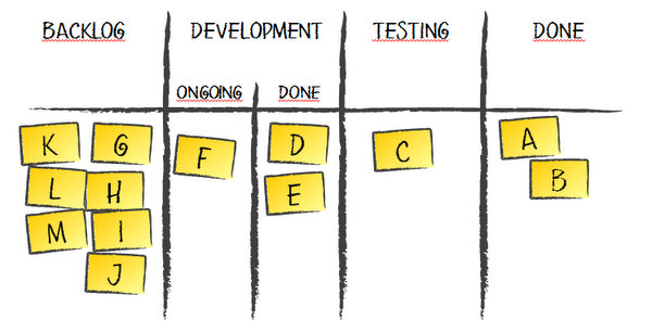
    For the sake of the rest of this article I’m going to use a simple process as a reference.
    Workflow

    We have a backlog, items that are in development or testing and stuff that is done. For the sake of Cumulative Flow Diagram examples it doesn’t matter whether tasks in development are ongoing or done and waiting for testing. However, as we will find later, there may be some indicators that would make tracking these two stages separately valuable.

    With such a workflow our Cumulative Flow Diagram may look like this.
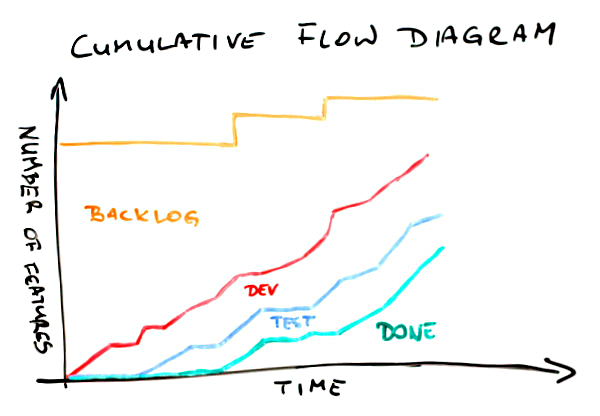
    Cumulative Flow Diagram

    First, the meaning of the lines. The green one shows how many items have been delivered over time. Everything that is between the blue and the green curves is stuff that is in testing. The area between the red and the blue lines shows how much stuff is in development (either ongoing or done). Finally, the top part below the orange line is the backlog – how many items weren’t yet started.

    In a glimpse we can find a few important bits of information about this project. First, after slow start a pace of delivery is rather stable. Pretty much the same can be said about work that is in progress – the pace is stable and things go rather smoothly. We know that the scope has increased a couple of times, which we can tell looking at jumps of the orange line. Finally, comparing where the green line (done) and the orange line (scope) are on a vertical axis right now we can say that we’re not yet halfway through the project.

    Quite a lot of information for the few seconds, isn’t it? Well, there is more.
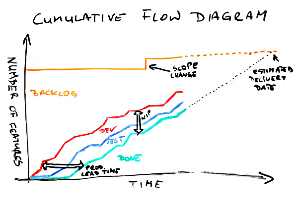
    Cumulative Flow Diagram

    On this CFD a few things have been shown explicitly. One is a scope change. We’ve discussed it on the previous chart too. Another one is the space between the red and the green lines. It represents work in progress (WIP). Note, basing on Cumulative Flow Diagram only you can’t learn how much work in progress you have precisely; it is some sort of approximation. Pretty good one, but only approximation. It is a very good indicator how WIP is changing over time though. There also is an arrow labeled “prod. lead time” where “prod.” stands for production. It roughly shows how much time we need to complete an item. Again, it shouldn’t be used as the ultimate lead time indicator but it shows pretty well what lead time we’ve had and how it changes over time. Finally, we can approximate slope of done curve to roughly estimate the delivery time. Of course if the scope changes the delivery time will change as well thus the scope line (the orange one) is also approximated.

    Now, we have even more information. Yay!

    You will rarely see such nice Cumulative Flow Diagrams though. And that’s good news actually. I mean if CFD looks plain and nice all the time you can only learn that much from it. The real CFD magic is revealed when things don’t go so well.

    Let’s go through several typical cases.

    Cumulative Flow Diagram

    In this situation the spread between the red and the green lines is growing over time. It indicates a really bad thing – we have more and more work in progress. That sucks. Increased WIP means increased lead time as well. Not only is time to market longer but also it is more and more difficult to deliver anything fast when we need it.

    That’s not the worst thing. The worst thing is that with increased amount of work in progress we also increase multitasking thus we incur all the costs of context switching making the team less efficient.

    Do we know that for sure? Um… no, not really. I make here an assumption that the team setup hasn’t changed, meaning that we have the same people spending similar amount of time on a project, etc. If it was Cumulative Flow Diagram for a team that is constantly growing and then it would be just OK. The chart may also present an increasing number of blocked tickets which definitely would be a problem but a different one then described above.

    In either case such a situation is a call for more analysis before jumping to conclusions. The potential reasons I offer you with this and following charts are simply the likely ones; not the only available.

    By the way, please treat all the following remarks keeping that in mind.

    One more interesting observation about this Cumulative Flow Diagram is that we have no clues where the root cause for increasing WIP lays. Neither development nor testing part seems to be steadily attached to any other line over time. A further investigation is a must.

    There are charts where we get some clues which stage of a process is problematic.

    Cumulative Flow Diagram

    Whoa, this time the development part compared to the testing part is really heavy. What can we learn from it? We don’t have problems with testing. Also, if a definition of testing is “testing and bug fixing,” which is a typical approach, it doesn’t seem that quality of work is much of an issue either. If we are to point fingers we’d point them to development part, wouldn’t we?

    And we might have been wrong. Of course one thing that may be happening here is a lot of items in development but few of them ready to test. Another issue though may be that there is a lot of stuff waiting for testing but availability of testers is very limited and when they’re available they focus on finishing what they started.

    How can we tell? We can’t unless we have more data. In fact, another line on the chart – one that distinguishes items in “development ongoing” from those in “development done” – would help. Without that the CFD is only an indicator of a problem and a call for a deeper analysis. After all, that’s what Cumulative Flow Diagrams are for.

    Another flavor of a similar issue is on the next CFD.

    Cumulative Flow Diagram

    We can find two things here. Let’s start with the more obvious one – the shape of the green line. It looks like stairs, doesn’t it? Stairs are typical when the last stage, which commonly is some sort of deployment, is done in cadences, e.g. weekly, biweekly, etc. Building on that, a stairs-shaped delivery line mean that work in progress and lead time would vary depending on a moment of release cadence you’re in. Maybe it’s time to make a step toward continuous

    There is one more thing here though. There is pretty significant, and increasing, number of items that are in testing but don’t get released. The gap between the blue and the green line is growing with each consecutive release.

    This one is a real issue here. It may mean that we have a problem with quality and we can hardly reach a state when an item has all the bugs fixed. It may mean that developers simply don’t pay much attention to fixing bugs but tend to start new stuff; at the same testers would follow up on new stories as they wait for bug fixes for the old ones anyway. It may mean that a code base is organized in a way that doesn’t allow releasing everything that is ready. Once again, the root cause is yet to be nailed but at least we know where to start.

    It seems we have more questions than answers. If you think that I’m not helping it will be no different with the next example.
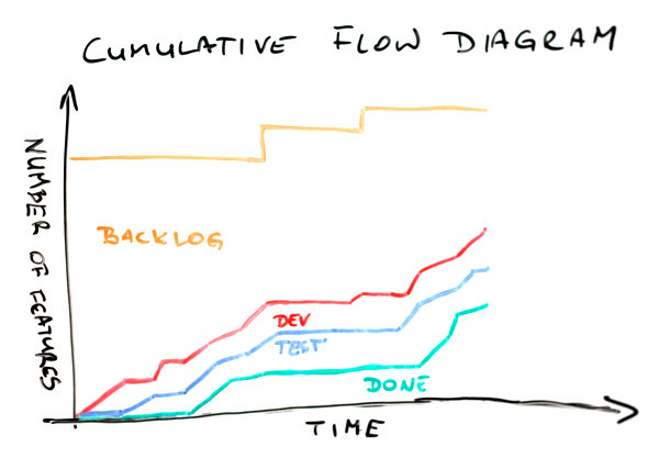
    Cumulative Flow Diagram

    This would happen occasionally in almost every team. All the lines flatten out. What the heck? The first thing I do when I see that is I check for public holidays or company-wide event happening during that time. It may simply be time when no one was actually working on a project and there is a perfect explanation for that.

    Sometimes it is not the case though. This is when things get interesting. If everyone was at work but the chart still indicates that no one got anything done it most likely tells a story about serious problems. A staging environment could have gone down so everyone has been focusing on bringing it back alive. Another project could have needed help and virtually everyone has been sucked there. There could have been a painful blocker that has forced everyone in the team to refocus for a while.

    In either case, whatever it was it seems to be solved already as the team is back on track with their pace.

    Another flavor of such a scenario would look a bit differently. It would give more hints too.

    Cumulative Flow Diagram

    There are two important differences between this and the previous Cumulative Flow Diagrams. One is that, in this case, only two lines flatten out; the development line keeps the healthy progress. The other is that ends of both the green and the blue line are as flat as a table top.

    The latter suggests that whatever is the problem it isn’t solved yet. What the problem might be though? It seems that the team has no problem starting development of new items. They can’t, however, start testing, thus they clearly can’t deliver anything either. One of probable hypothesis would be that there is something seriously wrong with either the testing environment or the testers.

    In the first case it just isn’t technically possible to verify that anything works as intended. In the second it seems something bad happen to our only tester (if there were more than one there would likely be some progress). There is another hint too. Developers don’t seem to care. They just start, and possibly complete, their stuff as if nothing happened.

    I’d say that these guys have to deal first with the issue and then discuss how they collaborate. I sense a deeper problem here.

    The same way as the previous example indicates an issue in the way people cooperate, the next one suggest a quality problem.

    Cumulative Flow Diagram

    Development line goes up in a stable and predictable manner. The testing curve? Not so much. And we better not mention the done line. Obviously we have more and more work in progress here over time – we’ve covered this one before.

    But wait, then suddenly the magic happens and everything goes back on track. At the very end we have decently small amount of work in progress and much stuff delivered. The smell here is how the done (and testing to some point as well) curve skyrockets at the end.

    How come that earlier such pace was impossible? I’d challenge the idea that the team suddenly become so fast. Of course they might have not kept the board up-to-date and then, out of the blue, have realized that they’ve had way more finished items that they’ve thought they had.

    More likely scenario is that under pressure they just deployed whatever seemed at least remotely close to working. If that’s true the problem isn’t solved at all and it’s going to come back to bite them in their butt. A curious reader may try to draw a picture how further part of Cumulative Flow Diagram would look like in this case.

    The next one is one of my favorites. I wonder why it is so far down the list. Oh well…

    Cumulative Flow Diagram

    This Cumulative Flow Diagram is surprisingly common. Let’s try to list a few things that we can find here. The development curve goes up aggressively. Halfway through more than 80% of items are started. Testing doesn’t go nearly that well. And delivery? Well, the start was crappy, I admit, but then it simply went through the roof. And it isn’t only a single day that would suggest delivery of uncompleted stuff. Odds are that these items are properly done. Wouldn’t bet the real money on that but wouldn’t be surprised if that it was so either.

    Of course we have very high WIP in the middle of this CFD but at both ends the gap seems to be significantly smaller.

    Ah, one more thing. It seems that at the end of the day we’ve delivered everything that was in the backlog. Yay!

    Now, what would be the diagnosis in this case? Time boxing! This is one of classic visualizations of what typically happens over the course of an iteration. If a team is comfortable with planning and has rather stable velocity it’s likely that they’d fill backlog with reasonable amount of new features.

    Then, given no WIP limits within the time box everyone does their own thing: developers quickly start many features having no pressure other than the end of the iteration to finish stuff. Eventually, the backlog is cleared so the team refocuses to finish stuff, thus the acceleration at the latter stages of the process.

    If you pictured a series of such Cumulative Flow Diagrams attached one to another you’d see a nice chain going North-East. You’d find many of these in Scrum teams.

    Another chart, despite some similarities to the previous two, suggests a different issue.

    Cumulative Flow Diagram

    In this case almost everything looks fine. Almost, as the done line barely moves above the horizontal axis. However, when it finally moves it goes really high though. What does it mean?

    My guess would be that the team might have been ready with the stuff but, for whatever reasons, they wouldn’t deliver. In fact this is one of typical patterns in fixed price, fixed date projects, especially in bigger ones. Sometimes a basic measure that is tracked is how many items are done by the production team. No one pays attention whether it can possibly be deployed in production or even staging environment.

    Eventually, it all gets deployed. Somehow. The deployment part is long, painful and frustrating though. Cumulative Flow Diagram representation of that pain and tears would be that huge narrow step of the done curve.

    Talking about huge and narrow steps…
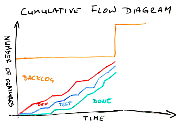
    Cumulative Flow Diagram

    Another chart has such a step too. We’ve already covered its meaning at the very beginning – it is the change of the scope. In this case it is not about the fact that such change has happened but about its scale and timing.

    First, the change is huge. It seems to be more than a half of initial scope added on the top of it. Second, it happens out of the sudden and pretty late in the project. We might have been planning the end date and now, surprise, surprise, we barely are halfway through again.

    Now, this doesn’t have to be a dysfunction. If you were talking with the client about the change or it is simply a representation of expected backlog replenishment that’s perfectly fine. In either case you it shouldn’t come as a surprise.

    If it does, well, that’s a different story. First, if you happen to work on fixed prices contract… man, you’re screwed up big time. It isn’t even scope creep. Your scope has just got on steroids and beaten world record in sprint. That hurts. Second, no matter the case you likely planned something for these people. The problem is it’s not going to happen as they have hell lot of work to do in the old project, sorry.

    So far lines on Cumulative Flow Diagrams were going only up or, at worst, were flat. After all, you’d expect that given the mechanism of creating the chart. That’s the theory. In reality a following chart shouldn’t be that much of a surprise for you.

    Cumulative Flow Diagram

    Whoa! What happened here? A number of stories in testing went down. The red line representing stuff in development followed but don’t be fooled. Since the gap between the red and the blue line is stable nothing really happened to the items in development; it’s only stuff in testing that was affected.

    Now, where did it go? Definitely not to done bucket – the green line didn’t move. It didn’t disappear either as the total number of items (the orange line) seems to be stable. A few items had to go from testing to backlog then.

    What could it mean? Without an investigation it’s hard to say. I have good news though. The investigation shouldn’t be long – such things don’t happen every other day. For whatever reasons stuff that was supposed to go past code complete milestone was marked as not started.

    I sense a major architectural or functional change. What’s more, it’s quite probable that the change was triggered by the tests of aforementioned items. Unfortunately it also means that we’ve wasted quite some time building wrong stuff.

    Another flavor of that problem looks a bit scarier.

    Cumulative Flow Diagram

    Again, the total scope didn’t change. On the other end every other line took a nosedive. Once again amount of stuff in development doesn’t seem to be affected. This time the same can be said about items in testing. It’s the delivered stuff that got back to the square one.

    It means that something that we though was done wasn’t so. One thing is that we were building wrong stuff, exactly as in the previous example, only we discovered it later. We likely pay the order of magnitude bigger price for the late discovery.

    There’s more in it though. This Cumulative Flow Diagram shows that we likely have problems with acceptance criteria and / or collaboration with a client. I mean how come that something that was good is not so anymore? Either someone accepted that without checking or we simply don’t talk to each other. No matter the case it sucks big time.

    Would the orange line never move down then? Oh yes, it would.

    Cumulative Flow Diagram

    I mean, besides an obvious case where a few items are removed from backlog and the only line that moves down would be the orange one, we may find this case. Using the technique perfected in the previous examples we will quickly find that a few items that were in testing are… um, where they are actually?

    Nowhere. They’ve disappeared. They haven’t been completed, they haven’t been moved back. These items are no more.

    What does it mean? First, one more time we’ve been working on wrong stuff (fools we are). Second, we’ve figured it out pretty late (but could have been later). Third, the stuff doesn’t seem to be useful at all anymore.

    It’s likely that we realized that we don’t know how exactly build this or that and we asked the client just to learn that they don’t need either of those anymore. It’s also likely that we’ve encountered a major technical issue and rethought how we tackle the scope possibly simplifying the whole approach. Whatever it was, if we had figured it out earlier it wouldn’t have been so costly.

    Finally, one more Cumulative Flow Diagram I want to share with you.

    Cumulative Flow Diagram

    Think for a while what’s wrong with this one.

    When compared to the previous charts it seems pretty fine. However, by now you should be able to say something about this one too.

    OK, I won’t keep you in suspense. In the first part of this CFD work in progress was slowly but stably growing. However, it seems that someone noticed that and the team stopped starting new stuff. You can tell that seeing how relatively flat the red line has become somewhere in the middle of the chart.

    Given some time testing and delivery, even though their pace hasn’t changed, caught up. Work in progress is kept at bay again and the team’s efficiency is likely improved.

    As you can see, despite past several examples, you can see the effects on improvements at Cumulative Flow Diagrams too. It’s just that CFD is more interesting in terms of learning that you have a problem than finding confirmation that you’ve solved it. The latter will likely be pretty obvious anyway.

    Congratulations! You made it through to what is probably the longest article in the history of this blog. Hopefully you now understand how to read Cumulative Flow Diagrams and what it may indicate.

    I have bad news for you though. You will rarely, if ever, see such nice CFDs as shown in the examples. Most likely you will see an overlapping combination of at least a few patterns. This will likely make all the lines look like they were tracing a rollercoaster wagon.

    Fear not. Once you get what may be happening under the hood of the chart you will quickly come up with the good ideas and the right places to start you investigation. After all, Cumulative Flow Diagram will only suggest you a problem. Tracking it down and finding an antidote is a completely different story.

    However, if you’re looking for a nice health-o-meter for your team Cumulative Flow Diagram is a natural choice.

  • Better Standups

    I never fancied the standard standup schema. I mean I see value in sharing what the team did yesterday what the team is going to do today and what are the problems the team has.

    Except these questions aren’t answered on a typical standup.

    The first problem is that we answer what specific individuals have done and will do. In any but smallest teams it’s the wrong focus to have. I mean if there are two or three of us it’s very likely that such updates are meaningful. With a couple more people we gradually lose track, and eventually interest, in what exactly is happening in the rest of the team.

    At the same we should be focusing on what is important for the team which may be something no one mentions because for example the biggest pain point is on a plate of someone who is absent or overwhelmed with other stuff that just doesn’t allow them to focus on the real problem.

    The second problem is that very rarely someone really answers to anything by first two questions, namely the issues part is often omitted. I like tweaking the third question, for example to something that Liz Keogh proposes: ”what I would rather be doing.” It helps only a little bit though as it’s almost as easy to avoid this question as the original one.

    The third problem is that with a bigger team a standup becomes just long and boring, and whenever a couple of people exchange a few sentences about any specific bit of work it shuts down almost all the rest of the team instantly.

    A very typical change I introduce is a standup around a board, be it a task board, a Kanban board or what have you.

    Then the discussion is mostly around important stuff that is happening right now and is visualized on the board. A typical pattern is: blockers first, expedite items second, stalled items third and then all the rest. I covered more elaborate version of this approach some time ago.

    Such an approach means that not everyone, every single day speaks up. But whenever anyone has a problem or is just trying to solve an issue too long there’s definitely an update from them on the way.

    Then, there’s always a call for action regarding important stuff, even if it just so happens that a default person for that item is unavailable.

    This means that standups around a board encourage collective ownership of work.

    In fact, there are way more call for action situations as this form of standup basically focuses on solving issues. This often means helping each other, taking over bits of work from others, etc. Whenever someone has hard time coping with all the stuff that waits for them they usually get an instant help.

    This kind of a standup is also shorter than a classic one. After all you don’t mention all the boring stuff that just goes as planned – everyone can see that on the board, so what’s the point anyway?

    It also is an occasion to catch all the inconsistencies on the board so it serves another purpose too. You don’t get that from a classic standup.

    I would also point that this approach does very good job in terms of keeping work in progress low. It simply changes the dynamics of the discussion toward everything that is in progress from a team perspective instead of work started by individuals. The latter doesn’t take into account all the waiting queues.

    Finally, it scales up pretty well. You can run such a standup with a dozen or more people and it still fits nicely 15 minute slot. It’s not rare when you need only one third of that even with such a big team.

    The impact of changing the standup pattern is almost instant. All in all, it makes standups more valuable for the team. Try this approach, especially when you struggle with the current one right now.

  • Happiness Chart

    Given the fact that my most recent project is done for the client that lives in a galaxy far, far away (OK, just on the other end of Europe) an electronic Kanban / task board is a default. And yes, this means my heart bleeds as I’m an uncritical whiteboard lover.

    It means that we’ve had a full whiteboard to use for different stuff and, as you may guess, it didn’t stay clear.

    The big part of it is used for a happiness chart. The concept is very simple: everyone, at some point of every day, draws a happy / neutral / sad face in their row. The face refers to our general attitude toward the project during that day.

    Happiness Chart

    A typical question is how strictly we should treat “toward the project” part. Should issues unrelated to the project, or work in general, affect what we put in the happiness chart?

    Hell, yes! Unless you are a robot and can fully isolate your private and professional lives. Interestingly enough, I know people who forget about their work in the very second they leave their workplace but I don’t know any that forget about their homes, families and friends when they enter it.

    Now, should we fill the happiness chart at the beginning or at the end of a day?

    Hell… um… it depends. We decided to do it at the beginning of the day or, more precisely, just after standup. This way we may consider it more a leading indicator than a lagging indicator. When a day has been good we likely see progress anyway. However, I would say that both approaches may work well. After all, you don’t look at the happiness chart in the context of a single day.

    OK, fine, it seems funny but what can you learn from such a fuzzy tool?

    A series of average-to-low moods from one person is an indicator that something is happening, either at work or outside. Either way a subtle inquiry may reveal a root cause and maybe open a couple of options of helping. If nothing else it gives you better understanding why someone is below their best.

    By the way, one could say that if you all sit in the same room you will simply see this. Well, good luck with that. I’ve seen too many frustrated introverts, who look exactly the same as um… enthusiastic introverts. I’ve met too many very expressive extroverts, who seem to change their mood and attitude faster than you can track it. I don’t believe in “you will see it coming” any more.

    By the same token you might understand better than one’s whining attitude is more of a pose than a real thing.

    Another thing is looking for patterns. A complete set of low mood faces from the team simply yells “screw up, big time!” Something definitely went wrong. You may know it anyway but don’t take it for granted. In either case that’s definitely a call for help.

    Especially happy set of faces tells a story about a major accomplishment even if it isn’t reflected at a task board. It might have been an especially painful blocker that’s just gone away or a risk that has been mitigated, etc.

    Then, if you pay attention, you learn hell lot about what annoys people. Issues with video conferencing stuff, client’s presence at standup, scope being changed back and forth or what have you. You will hear such things being thrown into the air when people fill the happiness chart.

    Given that you use happiness chart that looks a bit like calendar it also works great as planning tool. People can fill their planned days off. You can easily mark when the next retrospective happens, etc.

    Finally, it’s fun to use it. The very first change that the team proposed was freedom in terms of what exactly is drawn on the board. The decisive thing is the color used (red for unhappy, blue for average, green for happy) but the picture may be pretty much whatever. After a week we’ve already had a devil, an angel, a Moomin (OK, it’s Groke), a pirate, a guy in a top hat, a giraffe, a cat… you already get it, right?

    Our happiness chart became way more than simply a place where we mindlessly draw emoticons. It actually improves our moods a bit on the top of everything else I mentioned above.

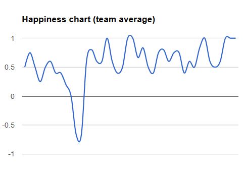
    By the way, it you want to play a little game look at the chart below. It describes average mood of the team (only people present on any given day). The possible results are anything between 100% (everyone was happy) and -100% (everyone was unhappy). Now, guess what might have been happening in the project and what kind of progress we were making.

    Happiness Chart

  • Portfolio Kanban: Why Should I Care?

    It’s an interesting observation for me: people keep asking me to speak about Portfolio Kanban. London, Krakow, Chicago… it seems that for me Portfolio Kanban is going to be the topic to speak about this year.

    When I started with Portfolio Kanban it was an experiment – a tool I wanted to play with to see whether it is useful at all. When you start speaking publicly about such things though, there is one important question you have to answer: why should anyone care?

    After all, unless the question is answered Portfolio Kanban is just a toy.

    So… why?

    When I look at work that is happening in lean and agile communities I see a lot happening on a team level. Scrum is a framework designed for a team level. When you look at Kanban implementations, vast majority of them are on the same level too. Now, should we be worried? Is it wrong? No! It’s perfectly OK. Well, sort of.

    Let me start with this:

    A system of local optima is not an optimal system at all; it is a very suboptimal system

    Eli Goldratt

    Focusing on a team level and a team level only we are optimizing parts as rarely a single team is a whole. I’m far from the orthodox view that we should focus on optimizing the whole and the whole only, as most of us don’t have enough influence to work on such a level.

    It doesn’t mean though that we should cease any responsibility for optimizing the whole system, no matter what sphere of influence we have.

    This is basically why improvements on a portfolio level are so crucial. They don’t have to be done instead of improvements of a team level or prior to them. In fact, a holistic approach is probably the best option.

    If you aim your efforts on a team level only you likely become more efficient, but the question is: efficient at building what?

    Processing the waste more effectively is cheaper, neater, faster waste.

    Stephen Parry

    If the wrong decisions are made on a portfolio level, efficiency on a team level doesn’t really help. What’s more, it can even be harmful because we just produce waste more efficiently. I can think about a number of wasteful activities imposed on teams on a portfolio level, but two are the biggest pains in the neck.

    One is starting projects or products that shouldn’t be started at all in the first place. There is dumb notion that people shouldn’t be idle, so whenever individuals or teams have some spare time it is tightly filled with all sorts of crazy ideas that simply aim at keeping people 100% utilized. That’s just plain stupid.

    Usually, even when people are busy, they get this kind of work anyway, as “they will cope with that somehow.” After some time not only do we run lots of projects or initiatives of questionable value but we have to spend additional effort to finish and maintain them.

    Another pain point is multitasking. All these filler projects are obviously of lower priority than regular work. So what people end up with is they keep switching between projects whenever higher priority tasks calls. The problem is that a context switch between two projects is even more painful than a context switch between two similar tasks within the same general context. Oh, and have I already mentioned that once you’ve finished those filler projects you keep switching back to them to do maintenance?

    So basically what you get is very low value work at cost of huge context switching tax. Congratulations!

    Oh, is it that bad? It’s even worse.

    If you are doing the wrong thing you can’t learn, you will only be trying to do the wrong thing righter.

    John Seddon

    If the organization starts all the fires on a portfolio level, teams end up trying to cope with that mess. If they care, they will make the wrong thing a bit better. Does it help? Not at all. The sad thing is realization what could have been happening instead, which is basically learning.

    The organization could have been learning what work really adds value. The teams could have been learning how to work better. On all levels there would have been opportunities to improve thanks to occasional slack time.

    And, by the way, the organization would have been operating more efficiently too, thanks to less context switching.

    This is basically why you should focus more on organizing your project / product portfolio.

    Why Kanban in this application then?

    I guess I already gave the answer between lines. Visualization, as always, enables harvesting low-hanging fruits. I mean, unless we see how screwed up we are, we often don’t even realize the fact. Visualization also helps to substitute everyday project-related wild-ass guesses with everyday project-related informed decisions. Sounds better, doesn’t it?

    Then there are WIP limits that enable conversations about what projects get started, how we staff the teams and how we react in all sorts of special case situations. In fact, without that bit changes introduced by Portfolio Kanban will be rather shallow.

    Finally, if you are aiming for improvements, Portfolio Kanban gives you a change mechanism that is very similar to what you know from team level Kanban implementations.

    The best part though, is how easily you can start your journey with Portfolio Kanban. Even though it tackles the part of the organization that is usually highly formalized and full of politics, Portfolio Kanban doesn’t require, at least at the beginning, to have everyone signed up for the idea. A single person can use Portfolio Kanban as a disruptive weapon and see what it brings.

    Seriously, it’s enough to have only one person willing to work consistently on Portfolio Kanban board to see the first yield of the improvements. And one doesn’t have to wait very long until the first meaningful discussions around projects start. Then you know something has already changed.

    Even when no one really realized you used Kanban to achieve that.

    If you liked the article you may like my Portfolio Kanban Story too.

  • Making Use of Estimates

    I’m not a fan of estimation. I try to avoid it when I can. However, I’m not orthodox. I won’t be telling everyone that refusing to estimate is the way to go.

    I admit that I’m now in a comfortable land of time and material contracts that give more flexibility to the clients and more safety to the vendors at the price of mutual trust. At the same time Lunar Logic is the first of my jobs that works this way, so I’m more than familiar with fixed everything sort of contracts too. In that world estimate is a king. A lousy king though.

    Despite the fact, that fixed price projects are a nightmare from my past life, we can’t forget about estimation at all. Even those awesome folks we started working with recently started with asking us to deliver estimate in story points or other abstract measure of our choice.

    I intended to track progress in the project with Cumulative Flow Diagram (CFD) that counts only a number of tasks completed. However, having individual estimates for all the stories in backlog it’s easy to have two CFDs: one tracking a number of stories and tasks and the other that refers to initial estimates.

    One might suppose that it would be basically the same data on both charts. And one would be wrong.

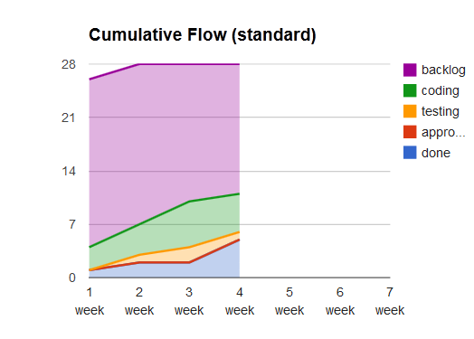
    Let’s start with the charts. Here’s standard CFD for the first few weeks.

    CFD

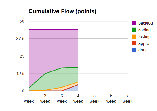
    And here’s CFD that bases on estimates in story points.

    CFD

    What’s the difference? In fact, there are quite a few of them.

    For the starters, the scope changed only on the first chart. What does it mean? Simply that despite no change in total points there were new tasks. In this case almost all of them were non-functional tasks like setting up the environment, design pre-processing and adjustments in existing code that enables integration with the new part of an application.

    There was also a split of one of stories to a couple of them for the convenience. The total estimate didn’t change although there was a new story to build.

    Another thing you may notice is that on the second chart we’ve finished anything pretty late in the project, while the standard CFD shows completion of a couple of features early. Again it is connected with non-value-adding and non-functional features that had to be completed to get the team running.

    Finally, and most interestingly, try to judge amount of work in progress and size of stories in progress looking at the charts. A hint: you will find the answer to the former in the first and to the latter on the second chart.

    Standard CFD tells you that we care about limiting WIP and avoid starting too much. The story point-driven chart shares a different story. Steepness of the coding curve indicates that we’ve started with heavy features. In this case heaviness was mostly driven by risks – the heaviest features were most risky ones. We decided to start with them to address risks pretty early in the process so if there’s a screw up on the way we know it as soon as possible.

    By the way, I don’t focus here on the data that you specifically get from CFD. You could draw exactly the same conclusions if you used burnup charts, which are gateway drug to Cumulative Flow Diagrams.

    Obviously, CFD can tell you a bit more, e.g. about the awesomeness of the client, as they don’t ever have anything stacked in approval. Whatever is ready it gets verified and accepted.

    Anyway, the point is that despite I don’t feel that detailed estimates in this project really pushed us further (maybe despite building trust relationship, but that’s a different story) we can still use the work invested in estimation to learn something.

    And, as you see, you can learn quite a bit using very simple tools.

  • Retrospectives Reloaded

    I’ve read and heard a lot advice on running better retrospectives. I’d even go that far to say that if you speak at agile event and you want an instant hit “how to run a good retro” should be very high on your list of potential topics.

    After all, this whole “getting better” thing seems really important to everyone and improvement is almost always a struggle for teams. A retrospective is a nice package; it’s pretty self-explanatory, it has a good name and it’s open-ended enough that you can adjust it to your needs.

    It’s not a new concept though. I was doing post mortems back then when agile was just a word in a dictionary. Same goal, different package. Well, maybe not that sexy, and that’s exactly why you should rather jump on a retro bandwagon to win the crowds.

    Anyway, the problem with vast majority of stuff I’ve heard or seen about running better retrospectives is simple: they are all recipes. You may apply them and they either work or not. Even if you’re lucky and they happen to work once, they quickly wear out. After all, how many times do we laugh at the same old gig?

    Then, we’re back to the square one. How to revive the next retro one more time?

    It’s because we get the wrong advice on retrospectives over and over again. It shouldn’t be “try this” or “try that.” The real magic happens when the thing you do during a retro is fresh and everyone gets involved.

    Both things are often surprisingly easy. You can count on people’s engagement when you don’t push them out of their comfort zones too far, e.g. I would say that singing in front of the team probably isn’t the best choice you might make. But all sorts of drawing are usually safe.

    And being fresh? Just think about all these funny ideas you discuss by the water-cooler. Playing an act, recording own version of movie classics, a concert, a cooking event, or cleaning a randomly chosen car on a parking lot are all such concepts. People were enthusiastic to sign up for such things. Wouldn’t they be so if it was a part of a retro?

    However, if you’re going to use a cooking event as an awesome idea for the next retro you understood nothing. Go, read the post again from the beginning. I don’t want to give you any recipe. I’m going to simply point the fact that every goddamn team on the planet Earth has a ton of fresh ideas for their next retro. It’s enough if you retrieve a single one of them.

    In fact, it’s even better. If you use one of those crazy ideas your team discussed a couple of days ago during lunch, odds are they will eagerly sign up for it.

    This is why I’m not going to be stunned with the next “better retros” session. Because, you know, I have such a session a few times a week. I just pay attention.