Tag: visualization

  • Visualization Should Be Alive

    I’ve had a great discussion recently. A starting point was information from Kanban board – basing on my knowledge it wasn’t up to date and, as it appeared later, it wasn’t without a reason. A way of visualizing how situation looked like in a team was sort of tricky.

    We used the situation to discuss in details what is happening and how we should visualize it. Anyway, one thing struck me in retrospect – the less visualization changes the fewer chances we have to start such discussions.

    A good (or rather a bad) example is my portfolio Kanban board. Considering I try to visualize there projects of different sizes it’s not that uncommon when, in the long run, there are few changes on the board. On one hand, this is acceptable and even expected. On the other, there aren’t enough “call for action” situations when people are expected to do something, like moving stickies etc. Those situations that trigger important discussions.

    This is also why I prefer Kanban boards that are built of rather small-sized work items than those that are filled with huge tasks. They just aren’t that lively. They tend to stall.

    And when visualization stalls its value diminishes. People tend to develop a specific kind of blindness. They start treating their information radiator just like another piece of furniture, which results in the board being exactly that – a piece of furniture. Not useful in terms of improving team’s work.

    So remember this: as long as you expect visualization to generate value, it should live. If it doesn’t, think how you can make livelier. You won’t regret.

  • Ball Flow Game

    If you visit Software Project Management on occasions you likely know that 100% utilization is a myth. A nice and simple experiment that shows impact of full utilization on effectiveness and at the same time presents value of WIP limits is a ball flow game.

    The rules are simple:

    • You get a group of people to process 20 balls.
    • Processing is just throwing a ball from one person to another.
    • The person who starts throwing the balls in is also a person who is last to touch the ball.
    • The ball should have at least minimal air time when changing its woner, i.e. it should be thrown not passed.
    • Everyone in the group should touch each ball.
    • The ball shouldn’t be thrown to any of two closest persons (the one on the left and the one on the right).

    The rest is pretty much team’s self-organization.

    The goal of the team is to process 20 balls as fast as possible.

    The team can arrange themselves in a way that is convenient for them, which most of the time means standing in circle. Then they set up the sequence: who is throwing to whom. And then, the fun begins.

    Following data is from the game I run with a group of 10 people.

    The first approach was no WIP limits at all, meaning that balls were thrown in as soon as the first person was idle. With this approach it’s not even the data that is most interesting but the looks of what’s happening. Balls are flying all over the place. People barely cope with coordination of passing the ball to the next person and coming back to the previous one to receive the next ball. Pretty often balls are dropped and left forgotten as new balls are waiting. It’s all chaos.

    And the clock is ticking.

    Simply by looking at the situation you may safely guess it is suboptimal organization. However it is how many teams still work these days. We decided to use it as a reference point.

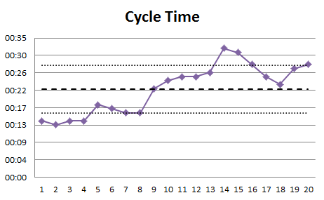
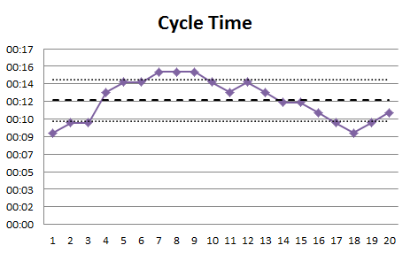
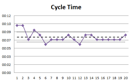
    Cycle time for each processed ball looked like this.

    One thing is that it could be as much as 32 seconds to process a ball. Almost 3 seconds per person for something as simple as passing a ball. Another thing is that variability of cycle times was high – anything between 13 and 32 seconds meant that worst case scenario was 2,5 times longer than the best case. This left us in a place when we were hardly predictable in terms of time needed to process the next ball.

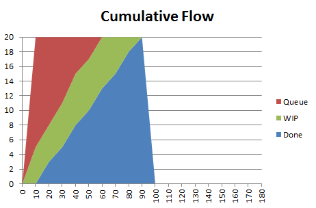
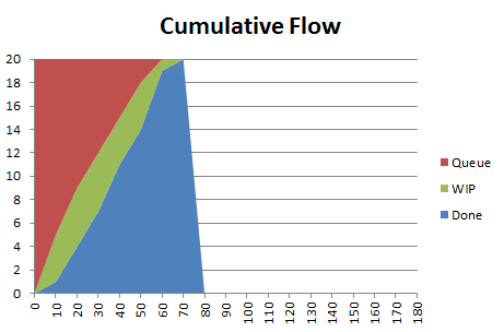
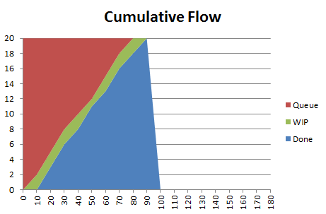
    One quick look at Cumulative Flow Diagram (measures were taken every 10 seconds) will show one of typical problems I see in teams: as the project goes further cycle times become worse (green part of the diagram becomes wider).

    Processing time of all the balls was 83 seconds.

    With the second round the team decided to limit work in progress. With no idea what WIP limit they should go they decided to try WIP limit of 5 balls, for the team of 10 people. Considering that processing time was very short – no one was expected to do anything special with balls – the crucial thing were handoffs. In ideal case each handoff requires 2 people, one passing the ball and another one receiving it, thus limit of 5. It also meant that for the processing time one of every two persons will be idle.

    First, the whole task was done in 63 seconds. Almost 25% improvement.

    Second, the way the group worked looked way better. Little chaos, no dropped balls, no collisions in flight, etc.

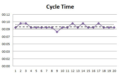
    Third, cycle time went down and became more predictable. This time it was anything between 9 and 15 seconds. Yay! We shortened our time to market.

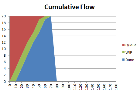
    Cumulative Flow Diagram also looked better. Steeper curves mean better throughput and green part width (cycle times) are kept under control.

    With such good results a natural consequence is a discussion about the optimum. We know that WIP limit of 5 is better than infinity but should we test WIP limit of 4 or rather of 6? The group decided to go with WIP limit of 4 in round 3 and results were interesting.

    The end to end time was 61 seconds. Basically no change at all as I could potentially address 2 second difference to fluency with throwing balls.

    Was it simply the same as in round 2 then? Pretty much the opposite.

    The most interesting thing was what happened with cycle times.

    There was only one ball that was processed faster than in 9 seconds, which was the best result in round 2. However this time variability of cycle times was reduced hugely (8 to 10 seconds). The team became highly predictable.

    Considering that we were processing identical tasks, this was something we should expect, but it didn’t happen unless we introduced strict WIP limit. By the way, this predictability is neatly shown in CFD, which now looks very stable.

    There’s one more thing hidden here too. With more strict WIP limit we introduced more slack time. This time, even in ideal situation when every ball is passed we still have two people idle. Yet the end effect is still the same. The difference is that this additional slack time can be invested to improve the process or automate the part of it so eventually the team becomes even more effective.

    In short: considering that we have the same end to end team performance more strict WIP limit is better than looser one as it sets us on a better path toward improvement.

    A natural next step would be probably trying WIP limit of 3. However having chance to play in controlled environment the team did an experiment with limit of 2 to see what would happen.

    Basing on results so far outcome of round 4 could be somewhat predictable. Best cycle times went down even more with top result of 6 seconds.

    However it came at cost of bigger variability as worst cycle time remained the same (10 seconds). We drove predictability down.

    Cumulative Flow Diagram, again, looked neatly – nothing to worry about.

    From CFD you can guess the key statistic here. Overall processing time went up. 85 seconds. A tiny bit worse than without limits at all.

    However, again, comparing only rounds 1 and 4 I believe that the one with WIP limits is a way to go. Considering that the whole task was completed in the same time we had a lot of slack time that could be invested in improvements, there was less pressure and significantly less chaos. In other words: short-term results are similar, long-term ones should be better with WIP limits.

    Now, why am I telling you all this? First, to show you the mechanism. You should be doing exactly the same thing with your real Kanban implementation tweaking WIP limits and measuring outcome of these changes to find local optimum.

    Second, there’s underlying assumption made here. One that is super-important. You need to measure how you’re doing otherwise you won’t be able to tell whether after changes you are doing any better than you’ve done before. If you don’t have meaningful measures already in use then start with this, before you play with your WIP limits.

    And now that you asked, no, I don’t consider your gut feeling “a measure.”

    Big thanks to Karl Scotland, who I learned the idea from. If you want to play the game I strongly recommend using spreadsheets Karl kindly shared.

  • The Project Portfolio Kanban Story: Better Board

    When applying Kanban on project portfolio level you’re dealing with different challenges than in case of standard Kanban implementation on a team level (if there even is such a thing). Both the flow dynamics and task granularity is very different, thus you need to focus on different aspects when designing Kanban board.

    This is basically why typical Kanban board design will often be suboptimal.

    Portfolio Kanban Board 2

    At the same time the biggest challenge you face on project portfolio level is defining and applying WIP limits. For the time being my thoughts on a subject are that depending on a specific environment teams would be choosing very different measures to manage WIP on portfolio level. However, as we as a community still lack experience from addressing different scenarios I’ll focus on the path I’m following. After all the story format I chose requires that.

    In my case the most reasonable thing I was able to come up with was a number of people involved in project work. Unfortunately the scale of the team (more than 130 people) didn’t allow me to use straightforward approach and scale up WIP limits with numbers.

    Instead of continuing my struggle to find a perfect measure that suits the current board I decided to redesign it completely.

    Whenever you read about Kanban you learn that it is an evolutionary approach. Kaizen and all the stuff. However one advice I have on designing a Kanban board in general is that when you start running circles with board evolution and see little or no improvements throw the whole board out and start from scratch. From one point of view it can be considered a revolution (kaikaku) but from another: you don’t really change your way of working, you just try to visualize it differently.

    Either way I took my own advice and started from a clean whiteboard. I also remembered another advice: not to stick to standard board designs. This is what I ended up with.

    First, there is no value stream or process in a way we understand it on a team level. Since the flow of index cards wasn’t dynamic I decided this isn’t information I should focus on that much.

    Second, on horizontal axis, instead of process there is a time line (monthly granularity). As variability of project sizes is huge I decided I need some sort of time boxes which I measure WIP against. With very few small engagements, ones that take us less than a few weeks, monthly time boxes looked reasonable.

    Third, I created swim lanes for teams. We don’t have 130 generic engineers, or Average Full-Time Equivalents, or whatever other inhumane label you can think of. We have teams that we strive to protect and teams do have specializations. It means the context of a team is very important and if it is important it goes to the board, thus swim lanes.

    Fourth, having such board construction I had to change my approach to index cards. Instead of having a single index card representing single project I ended up with territory-driven approach. A project covers a territory both in terms of team(s) and time. Looking at index cards with a project name you can instantly guess which team is working on the project and how long it’s going to take them. And the best part: a size of index card in any given month represents roughly how big part of a team would be involved in work on a project. This way we can easily show a few smaller projects as well as on big or any combination of those two.

    Fifth, as one of Kanban base concepts is pull it is represented by backlog area – green cards on the left side of the board. These are projects that aren’t yet started. The specific swim lane they are neighboring show preferable team to work on a project. However, it rarely is such a direct dependency: this team will do the project as there is no other one suitable to do the job. Most of the time we assume that another team can build the project too. Each time a project goes into development we decide, at last responsible moment, which team will take it.

    Of course there are some nice additional flavors here as well. Violet and yellow index cards differentiate maintenance projects from new ones. Green card are for projects that aren’t yet started and once they are we switch to yellow. Red index cards represent overrun in projects that are late. As we work on fixed price, fixed time projects we roughly know up front how much time and people we want to invest into a project. When something bad happens and this plan changes we show that. After all we put more attention to challenged projects.

    A simple fact that we are working on fixed time, fixed price projects doesn’t mean our arrangements never change. They do. Any time something changes we just update it on the board, same as we’d do with any other board. We just keep the board updated as other way its value would diminish.

    This Kanban board design definitely tells more than the initial one but I started this whole revolution to deal with WIP limits. What with them?

    Well, there still aren’t explicit WIP limits. However at this moment there are implicit WIP limits and information about them can be pretty easily extracted. Considering that I use territory-driven approach to index cards WIP limit is show by vertical axis of the board. Each team has a limit of one full-sized sticky note (representing whole team) per month which can be split in any way.

    In other words we won’t start another project unless there’s some white space that this project would fit into as white space represents our spare capabilities. Actually, it may be a bit of simplification as on rare occasions there are project we just start, no matter what. But even then we either can make such project fit the white space in a reasonable way or we need to make some more white space for it.

    Even though such WIP limits aren’t explicit, after some time of working with the board I can tell you they do the job. They do, not only in pulling new projects into development but also, and more importantly, in long-term planning as we have visibility a year ahead and can confront our capabilities with planned sales etc.

    With this board, for the first time from the beginning of my journey with project portfolio Kanban I felt satisfied.

    See how we come up to this point – read the whole story.

    Advertisement: Infragistics® NetAdvantage® for Windows Phone gives you rich, innovative mobile UI controls to build high-end mobile user experiences for Microsoft® Windows Phone®. Their high performance, eye-catching data visualizations, mobile form factor optimization, touch gesture support, and alignment with Metro usability guidelines take your social media connected mobile applications to the next level.


  • Alternative Kanban Board Design

    It started with Twitter discussion. Then I followed with a post on standard Kanban board designs. Dominica DeGrandis added her perspective as well. By the way, there’s one lesson I have to take from Dominica and from discussion on Twitter – we need to show people different Kanban board designs so they don’t get fixated on a standard and just stick with it.

    In the meantime I was selling Kanban to my wife, as we both believed it may help her in coordinating projects, which is what she does at her workplace. An interesting part is that she works in land surveying industry – something completely different than our everyday reality in software development business.

    And after the discussion she comes back home and tells me that she has to show me something. It appears that it is a picture of her very first Kanban board. Out of curiosity I’m asking her about meaning of different artifacts on her board and it strikes me that she’s done exactly what we want people adopting Kanban to do: she’s used Kanban board examples I drew as, well, just examples. And then she’s come up with her original design reflecting her own constraints, which are pretty different than in typical software projects.

    First, the board.

    Now, that you ask, no, it doesn’t seem like a “standard Kanban board” whatsoever. Where is the process? Where are the limits? If these questions are your first thoughts than you are fixated at least a bit.

    You should rather ask how the process looks like. It’s a bit tricky as for each big task there are a few stages. There are these which have to go one after another, but there also are those which can be done in parallel. In short: process isn’t linear.

    What more, depending on a task process can be built out of different stages. Imagine that for one task you do the whole production, from idea definition to deployment, for other you do only development, and for another only testing and deployment. OK, now you have an idea how it looks like. In short: process isn’t homogenous.

    So the basic idea is that process is defined per task. It can be safely assumed that project manager, or whoever coordinates the work, knows how to cope with each task. What is the role of columns then? Priorities! The old idea of classes of service. The closer the task is to the left side of the board the more important, or urgent, it is to deal with the task.

    Different colors of index cards are used to mark different clients as it is somehow important.

    Then, we have a trick, which I like the most. As process depends on a task it is defined on the fly for each task separately and represented by small stickies attached to index cards.

    Stickies show stages, subtasks, you-name-it which have to be done to complete a task. Green one means the subtask is completed, yellow marks ongoing one, while red color is used for blocked work (which is sort of typical situation). Labels on stickies say what kind of stage/subtask it refers to. In other words they define the process.

    Instead of defining complex graph of all possible states with dedicated Kanban board for each state we just add needed stages as we go. Isn’t that agile?

    Another nice thing about this board is how limiting work in progress can be handled here. We neither have old-school homogenous process where we limit number of tasks per stage nor dedicated boards assigned to different people where limiting WIP is done per board. However we can easily say which tasks/subtasks are ongoing: yellow stickies tell us that!

    We can limit WIP by limiting the number of yellow stickies which are on the board. In a given situation it is actually something which comes very handy, as a number of people involved in doing work is changing pretty rapidly and limits can be adjusted on the fly depending on the current situation.

    What I really like about this Kanban board design is that is addresses all the specifics of the situation in a neat way, yet it is perfectly aligned with all the Kanban principles.

    And this is why I love to work on Kanban with people from outside of IT industry. Since their constraints are so different than ours they come up with fresh Kanban board designs as our standard solutions just don’t work for them.

    Advertisement: Want to have such nice Kanban boards in your presentations or blog posts as well? Check InfoDiagram Kanban Toolbox. Use pawelBBlog code to get $10 discount.


  • Don’t Stick to Standard Kanban Board Designs

    As I’m lagging a bit with my reader I read recent Jurgen Appelo’s article on networked Kanban yesterday. An interesting reading, especially that it ignited a few thoughts (and a great discussion on Twitter with Jabe Bloom, Jim Benson and a few others).

    First, Jurgen’s experiments with Kanban boards are perfectly coherent with Kanban principles. We are told to visualize workflow, not to use a specific Kanban board design.

    Second, value stream mapping, which is used as one of the basic techniques by many Kanban proponents, is limiting and it brings you back to a standard Kanban board design. David Anderson avoided using the term in his writings and it wasn’t without a reason.

    Third, we use examples of typical board designs as it is so hard to explain the whole thing without showing these examples, yet it makes people fixated on typical boards and eventually their board designs are suboptimal.

    Finally, I sometimes feel we actively harm people showing them standard Kanban board designs. We prompt them to use one of our well-done solutions instead of looking for the one which is adjusted to their context and reflects their process well.

    Now, this is tricky, we’d like people to start with a clean whiteboard and totally open mind and to come up with something which reflects the way they work, presents important information in accessible and understandable way. It is pretty open-ended task, isn’t it? Unfortunately also the one which may make people totally confused.

    I’m not sure if I’d even be on the Kanban land now if I was starting with such task. I was more than happy to use the most common board design as a starting point. Now I don’t have problems using uncommon designs (just wait to see my portfolio level Kanban boards) but yes, it took some time to get here.

    Either way, my message is: no matter whether you’re just starting with Kanban or are rather advanced don’t stick to standard Kanban board designs. If you have no better idea, use them – that’s what they are for. But please, please, please, don’t treat them as the one and the only way to visualize workflow.

    On a side note: I find it amusing working on visualization with people from industries different than software development. They aren’t constrained with the good old process of building things, which was being hammered into our heads for years, namely: analyze, design, build, test, deploy. And they often come up with uncommon designs on the very first approach. Quite a lesson for us I would say.

  • Visual Management

    When I’m speaking at different events I usually keep evangelizing Kanban. Well, it’s sort of easy when you speak to an audience which is aware of this whole Kanbanish thingamajig. They may be even wrong when it comes to answer what Kanban really is but we still have a common starting point.

    The challenge starts when you try to ignite with the idea people, who not necessarily are aware of agile, lean, craftsmanship, whatsoever. Oh, maybe they even know something on the subject but they aren’t that much into it.

    Let me explain myself a bit more. If you go to a conference like Lean Kanban Central Europe (and you definitely should) you can safely assume people know the basics. On the other hand, when you go to a regular software development, let’s say Java, conference where you face folks who came there to see, well, Java stuff you can’t assume they’re all crazy about software craftsmanship, agile, lean or whatever is hot these days.

    So the question is: how do you reach these people with the stuff you believe in?

    In my case I work in the context of Kanban, so I started thinking what a gateway drug to Kanban is. My answer for this issue is…

    Visual Management

    I once wrote that visualization is my favorite part of Kanban. I also confessed that I started consciously using visualization apart from Kanban as a separate tool.

    And I want you to follow me on this path. I don’t set any pre-requisites. You may be a regular attendee on agile and lean conferences and know Kanban by heart. You can also be ignorant in terms of all that stuff and visual management should appeal to you as well.

    This is what you’ll see me advocating on occasions. OK, what is visual management? If you go with Wikipedia definition you will learn that…

    Visual control is a technique employed in many places where information is communicated by using visual signals instead of texts or other written instructions. The design is deliberate in allowing quick recognition of the information being communicated, in order to increase efficiency and clarity. These signals can be of many forms, from different colored clothing for different teams, to focusing measures upon the size of the problem and not the size of the activity, to kanban and heijunka boxes and many other diverse examples.

    In other words we use simple “visual signals,” which may be sticky notes, color pins or magnets, graphics, etc to share information among a group of people. How?

    I could have been describing how one can apply visual management in their team but let me do it in more visual way. Yesterday I had a session at ABB Dev Day, which was a very nice event addressed to developers. When I say “addressed to developers” I think that I have no freaking idea what I was doing there as my last code check-in is dated to 2003 or something. What more, my session was probably the only one which didn’t show or mention the code in any way. Now you understand the challenge I chose to face.

    This is how I tackled the challenge

    By the way: If you happened to be at ABB Dev Day please rate my session and/or leave feedback.

    I owe you a few words about the event itself. First of all, kudos for hosts for organizing high-quality free event. It reminds me good old times when local branch of Microsoft was organizing such events twice a year spreading the word about their technologies.

    Despite no one paid to be there the room was full until the very end. To be honest, it doesn’t come as a surprise really as sessions were interesting, even though they touched a surprisingly wide range of subjects. One thing I could complain about is networking, which didn’t work that well, but it’s always tricky on 1-day conference where there’s no evening event and everybody is in rush to come back home.

    From a perspective of a speaker I can’t say anything but I’m totally happy with how I was handled by hosts. In other words, if you have a chance to speak at the next ABB Dev Day, don’t hesitate even for a minute.

    And if you want to hear me speaking on visual management, and sharing my passion for putting everything on the wall in your office, and spreading my love to whiteboards and sticky notes, just let me know – we’ll work something out. As I’ve already told you there are no pre-requisites – it is a tool for both beginners and vets.

    As my last slide says: Try it! You won’t regret.

    Advertisement: Want to have such nice Kanban boards in your presentations or blog posts as well? Check InfoDiagram Kanban Toolbox. Use pawelBBlog code to get $10 discount.


  • Kanban Story: Kanban Board Should Reflect the Reality

    The other day I had a discussion over a Kanban board design. A team has realized the board doesn’t reflect the way they work ideally. We started analyzing what happened. What did actually introduce a disconnection between the reality and the board? We ended up with quite an interesting conclusion. It appeared that the board showed the process as we’d like to see it. Unfortunately in reality the situation was far from optimal. The team wasn’t able to follow the “ideal” process even though they would like to do so.

    A natural reaction was asking a question: should we keep the board as it is and try hard to adjust the way we work to the “right” way, or we should sort of degrade the board to sad reality.

    First of all, I understand why this question pops up. We naturally want to keep the board “better” so as to help us improve our process. We expect the board to be the sign pointing toward the ideal.

    Except Kanban improvements don’t happen this way.

    Yes, you’ve already have my answer in the post title so you shouldn’t be surprised. The board should reflect the reality no matter how sad it is. The reason is simple: when you work with Kanban you make everyday decisions basing on what you see on Kanban board. Now, if the board lies you are likely to make wrong decisions.

    We probably discuss decisions like “whether I should start building another feature or maybe help with testing the other one” or “are we ready to deploy it into production yet?” However, if such wrong decisions stack up they don’t do any good to you, your team or your project.

    Not only is there hardly any improvements at all but you actively harm the project.

    Kanban improvements work differently. People change their behavior or attitude basing on what they see on the board and constraints the board enforces on them and not because the board shows the ideal world. So first, there should be a change in the way the team works and only then we should adjust the board.

    In other words the board should always reflect the reality.

    If you liked this post you may also like the whole Kanban Story series, which is a documentary of one team’s adventure with Kanban.

  • Kanban: When It Is Hard to Map a Process to a Kanban Board

    I was asked for an advice the other day:

    “We have a problem with mapping testing stage into our Kanban board. In ideal world we would test a feature once it is developed, and deploy it on client’s testing environment if and only if every bug we find in the feature is fixed and verified. Unfortunately the reality isn’t that nice – pretty often we deploy a feature even though testing isn’t finished or some bugs aren’t fixed. Sometimes the feature passes user acceptance tests (UAT) even though there are known, sometimes even major, bugs on our side. It introduces a mess into the Kanban board as we have features shown as under testing even though they are already deployed so basing on the board it is hard to say what exactly is happening with a specific feature.”

    One of answers could be: fix your damn development process and bagger off. However I don’t count it as a good answer really. I mean yes, it is broken process which generates mess so we should work on that as well although it’s a longish discussion and it’s definitely not my point here.

    My point basically is: if your process doesn’t suit your Kanban board, adjust the board otherwise every time you look at the board trying to make a decision you will stare at fiction. You don’t want to make decisions basing on fiction, do you?

    OK, in this case a starting point looked something like that:

    The basic problem was that in reality testing was done throughout testing, deployment and UAT phases. Even worse, given that it’s a client who says the feature passed UAT, meaning the exit criteria is acceptance from the client, it was possible that testing was still ongoing while the feature formally was at the right edge of the board (UAT done).

    In short: when looking at the board it was impossible to say which features have been tested, which are being tested and which are yet to be tested.

    A question: how to map such situation into linear process, which we usually have on Kanban board? Well, you basically can’t do it. Fortunately, and correct me if I’m wrong, we were never told that we need to map everything into a linear process. Actually we weren’t even told we need a Kanban board. We were just told to visualize workflow.

    Coming back to the point, we ended up with a conclusion that in this case testing is an ongoing activity happening concurrently during a big part of the whole process. Digging deeper we decided that basically there are only two types of bugs related to any feature: these which would block us to use the application in production and those which wouldn’t. It doesn’t really matter whether a bug is minor but the client insist on fixing it or an issue wasn’t found by the client but from our perspective it is a major problem – we just wouldn’t push the application with this feature into production.

    What struck us at that point was that such information can be easily attached to a feature: we potentially could use a feature safely or not. It’s not a stage of the process – it is a status of a feature. Why shouldn’t we show it as a feature status though? Say, a small red sticky note attached to a feature when it isn’t good to go and a green one when it is.

    To be perfectly compliant with Kanban rules we should make the policies explicit – what does it mean that a feature is or is not good to go? At this point, it was pretty easy. A feature isn’t good to go either when its testing wasn’t completed or we have at least one unfixed blocking bug submitted to this feature. In such situation we should have a small red sticky attached to the feature. On the other hand, a feature is good to go when its testing was completed and there are no open blocking bugs. In this case we attach a small green sticky to the feature.

    One more tweak which was pretty obvious: as we want to distinguish features which we’ve started testing from those we haven’t, we attach small red sticky exactly at the moment when testing starts.

    The board after changes looks like that:

    Looking at the board you can tell that feature C went through internal tests and there are no known blocking bugs. On the other hand, feature D which is at the same stage of the process (UAT) isn’t good to go, for whatever reasons. We also have a situation where feature B, which passed user acceptance tests (UAT) have a red sticky attached to it, which means there is still something wrong with it – most likely a bug found internally but the one which is important enough that it has to be fixed before we consider a feature done-done.

    We can also easily distinguish features which are being tested from those which aren’t. Features F and H are of the former group and features E and G are of the latter. Note that feature E is on the later stage of the process than feature H and yet is wasn’t touched by a quality engineer even though the feature H was. By the way: it may be perfectly reasonable decision when you have to make constant tradeoffs what is more important and goes first and what is less important and waits for its turn.

    To summarize: what we basically did was we came back to roots. When teams start playing with Kanban one of the first things they do is mapping their current process into a Kanban board. It seems this activity isn’t exclusive for the first day only. On occasions we notice that our Kanban boards don’t precisely describe the process we follow and this is exactly the moment to review and improve the board.

    Another lesson here is that you shouldn’t try to adjust your process to simple constraints the basic board sets. If your approach is: the reality should suit my board and if it doesn’t so much the worse for reality, your board will quickly become irrelevant and you will get no value from it whatsoever. If the most basic methods can’t help to map your process into the board look for methods which work, even if it takes some more effort and creativity. The board itself is as flexible as it is physically possible. Given that you use the physical board that is. Use this power.

    And then, once you solved your own problem, don’t forget to improve constantly. In this case I have at least a couple of ideas for improvements but there’s no point in applying all the new ideas unless you validate the older ones. With the right mindset there will be a lot of occasions to try out new concepts with no doubt.

    If you liked the article check out The Kanban Story – a documentary of discovery and implementation of Kanban in one team.

    Advertisement: Want to have such nice Kanban boards in your presentations or blog posts as well? Check InfoDiagram Kanban Toolbox. Use pawelBBlog code to get $10 discount.


  • The Kanban Story: Skipping Part of Process

    The more complex your process, and your Kanban board, becomes the more likely it is you’re familiar with the following situation: you work on a task which doesn’t go through each and every stage of the process so you’d like to skip one of two of them.

    Consider a very simple board.

    What happens when we build a feature (feature E) where there’s nothing to be documented? What to do with a sticky note on the board? Should the process be changed?

    What happens when we have research task (feature H), which we don’t know outcome of, and we want to put it on the board? What if after research (development) we decide that it’s not going anywhere to a product? I mean we’re done with development but we don’t plan to do anything more about the task: neither testing, nor documentation, nor deployment.

    Before we go further I have another question: does this specific situation happen frequently? If not then don’t even bother. If it is an exception then treat it like exception. You don’t get points for following the process religiously.

    However, if it happens at least from time to time you should probably stop and think. One idea is redesigning the board in a way which incorporates such situation. Except you’ll likely end with conclusion that you have two different processes out there: one for regular development and another for research (or no-documentation development). So we come back to a question what to do with that?

    Well, you can split tasks into two boards but this way you either loosen your limits, e.g. additional limit for one research task, or you lose some flexibility, e.g. splitting your current limits among two boards. Either way I’m not a fan of the approach.

    What we ended up with in such situations was just skipping parts of the process which were irrelevant. No documentation? The sticky note goes directly to documentation done column instead of testing done. No follow-up after research whatsoever? Um, seems like we’re done done with this one so we should probably put the sticky note in the last column.

    Again, we don’t get points for being ideally adjusted to the process. The board should reflect the way we really work and it shouldn’t constrain us too much. If this is how things really look like why shouldn’t we just show it?

    Skipping parts of the process on the board for specific tasks is an option to consider. One advice though: as with any other movement happening on the board, make transition criteria explicit. If something goes directly from development to done column everyone in the team should be able to tell precisely what it means. And of course the answer should be basically the same each time.

    If you liked this story make sure you check the whole Kanban Story series.

    Advertisement: Want to have such nice Kanban boards in your presentations as well? Check InfoDiagram Kanban Toolbox. Use pawelBBlog code to get $10 discount.


  • Visualization: Don’t Get Attached to a Specific Tool

    If we are in Kanban world when we think visualization we see a Kanban board. We see a process mapped into columns with limits attached to them. We see sticky notes, which represent minimal marketable features. We see additional visuals which help to show priorities, blockers, people who are responsible for a task etc.

    We mentally substitute visualization with the Kanban board.

    To some point it works great. Well, after all it’s not without the reason that a Kanban board, or more generally a task board, became a tool of choice of so many teams.

    However, it was never written that one of few Kanban rules is using Kanban board. Please point me to such advice if I’m wrong. Anyway, the rule is about visualization and Kanban board is only one of possible means to this end.

    One of great lessons from Kanban Leadership Retreat was how many different approaches are possible in terms of visualizing work. Actually typical Kanban board looked kind of boring among that bunch of great folks as basically everyone had at least a couple of ideas how it can be done differently, depending on a specific situation of course.

    The message is: it doesn’t really matter how you visualize your work as long as you are successful at that. Task board or Kanban board is fine, and it usually is very intuitive to use by a team, but quite often there are better ways to do it.

    Consider a situation where you deal with a lot of small tasks. Do you really need to put each and every 5-minute-long tasks onto a post-it? Maybe there are more efficient ways to deal with them?

    On the other hand, what about tasks which last long months? As I’m playing with project portfolio level Kanban it is a very timely question for me.

    A classic form of the board, which I currently use, isn’t likely the best possible approach. I have at least a couple of ideas how to change it. And yes, now that you asked, I was totally inspired on Iceland event to improve my project portfolio Kanban board.

    Probably it won’t be a Kanban board as we know it any more. I will still use stickies and whiteboard but it’s not going to look like any other board I’ve had so far. And that’s the real lesson I got on Kanban Leadership Retreat.

    Don’t get attached to a specific tool. Kanban board is just a tool. Visualization is way, way more than that.

    It’s kind of funny to realize how we learn to treat some things as obvious, like having Kanban board as a part of introducing Kanban. Fortunately, at some point of time we just realize it’s only a tool and we should use it as long as it is useful. If it’s not it’s better to use another one.

    Advertisement: Want to have such nice Kanban boards in your presentations as well? Check InfoDiagram Kanban Toolbox. Use pawelBBlog code to get $10 discount.