Tag: visualization

  • Portfolio Kanban Board

    One thing that I learned quickly when I started experimenting with Portfolio Kanban is that a classic, flow-driven board design isn’t particularly good in vast majority of cases.

    Board Designs

    Long story short, I ended up redesigning the board structure completely and it worked much better. In fact, it worked so well that I started proposing such a design as a starting point whenever working with portfolio Kanban.

    Portfolio Kanban Board

    Interestingly enough, as Kanban adoption of portfolio level progressed I started seeing completely different approaches to visualization. Not that they were worse. They just focused on different aspects of work.

    One that popped up early was two-tier board that addresses different granularity of tasks at the same board. We can track the roots of this design to David Anderson’s time at Corbis. Since then it was picked up to manage portfolios.

    Portfolio Kanban Board

    Another example came from Zsolt Fabok, who was inspired by Chris Matts. What he proposed was a board that stresses expected delivery dates and how an organization is doing against these dates. Again the board design is completely different from the ones we’ve seen so far.

    Portfolio Kanban Board

    Another interesting example that I like is a portfolio board that visualized non-homogenous flow of work. This still is one of the most unusual board designs I’ve seen and yet it makes a perfect sense given the context.

    Portfolio Kanban Board

    By that time it was perfectly clear that there is no such thing as a standard design of Portfolio Kanban board. Each of these designs was fairly optimal if we considered the context. At the same time each of the boards was designed to stress a different aspect of work.

    The design I ended up with in my Portfolio Kanban story revolved around available capabilities and commitments. The two-tiered board design focused on flow of coarse-grained items and breaking work down to fine grained items. The deadline driven board based on an assumption that the most critical aspect of work are delivery dates and monitoring delays. Finally, non-homogenous flow board design addressed the issue of different flows of work in each of the projects.

    Which design is most useful then? It depends. To address that question we first need to answer which aspect of our work is the most important to track on a regular basis. To get that answer we need to discuss risks.

    Risk Management

    Obviously, risk management is a multi-dimensional issue. Some dimensions would be more interesting than others. The word “interesting” typically translates to the fact that we are more vulnerable to a specific class of risks or that we are doing especially badly against managing that class of risks.

    A typical example in the context of portfolio management would be overburdening. We commit to more projects or products than we can chew. We end up having our teams juggling all the concurrent endeavors. As a result we see a lot multitasking, context switching, and huge inefficiencies.

    In such a case the most interesting dimension of risks would be one related to managing available capabilities and ongoing commitments. And that would exactly be information that we’d like to focus on most when designing Portfolio Kanban board.

    That’s by the way almost exactly the process I went through when I proposed capability-focused board design. Of course, back then the thought process wasn’t that structured and it was more trial and error.

    There are some additional aspects of the story, like the huge variability of size of the projects that we typically see. This would affect the details of the board design as well. In this case relative size is visualized as well.

    The most important bit is that we start with the most important risk dimension. This should define the whole structure of Portfolio Kanban board.

    Coming back to different visualizations I mentioned we can easily figure out what was the key class of risks in each design.

    In two-tiered board the biggest concern was smooth flow of coarse-grained items (feature sets). We can also figure out that variability in size of feature sets wasn’t that much of a problem. Given that we’re talking about product development organization and that they are in full control of how they define feature sets, it does make a lot of sense.

    Delivery date driven board stressed how important risks related deadlines and timeliness of delivery were. We may also notice that there isn’t much stress on flow of work and not that much focus on addressing potential overburdening either.

    The design with non-homogenous flow, as its name suggests, pinpoints that most important risk dimension was managing flow. On the other hand risks related to capability management and overburdening don’t seem so important.

    Optimal Design

    The structure of Portfolio Kanban board can show only that much. We can’t visualize all the risk dimensions using the board structure alone. David Anderson in his Enterprise Service Planning talk points that it is common that organizations track 4-8 different dimensions of risks. The board design can address one or two.

    Make it the two that matter most.

    Where would others go? Fortunately we still have items on our board, whatever we decide them to be. We can track information relevant for other risk dimensions using information on index cards. The design of the items on the board is no less important than the design of the board itself.

    Designing Portfolio Kanban board is not an obvious task. We don’t even have a standard approach – something similar to a flow-based design we commonly use on a team level. Understanding how we manage risks is the best guidance that can lead to fairly optimal board design quickly.

    Of course one alternative is to go through a trial and error process. Eventually you’d land with similar outcomes. A quicker way though is to start with understanding risks.

  • Why Kaizen Boards (Typically) Don’t Work

    A Kaizen board is a neat concept. It’s a visual tool that keeps track of all the ideas for improvements gathered across a team and then helps to analyze the status of ongoing improvement experiments. What we get from using a Kaizen board is we encourage everyone to participate in improvement process, visualize ongoing and planned improvements and give ourselves some sort of a tracking mechanism.

    That’s the theory.

    In practice I haven’t seen such a board that would work well.

    I don’t say it isn’t possible to make it work. I just say it’s unlikely.

    To answer why I think so, I have to bring the old story repeated multiple times in the context of Lean. When Japanese started kicking Americans’ butts in automotive industry in the second part of twentieth century Americans sent their managers to see what’s so different in factories in Japan. Surprisingly enough Japanese were super-open and transparent with all the tools and practices they had in place. Americans meticulously noted all the novel stuff they learned and implemented the same tools and methods back home. Guess what. It didn’t work.

    It didn’t work because all these practices weren’t really game changers. The real game changer was underlying mindset that actually made these tools and methods work. By the way, this was also a reason why sharing all the secrets about practices wasn’t a problem. They weren’t nearly enough to make a difference.

    We pretty much recreate the same story when we try tools like Kaizen boards or when we create Kaizen teams. We introduce a tool and believe it will change the game. It won’t.

    The magic behind thousands and thousands of improvements implemented in Toyota every year is not any of the tools. It is a culture that supports trying stuff out. It is mindset that enables that. All that continuous improvement is happening not because people submit improvement ideas to Kaizen boards but because people are actively experimenting. They do stuff.

    If you tried using a Kaizen board this picture may be familiar. There was lots of stuff submitted to the board but very few, if any, real changes were observable in your working environment. Now ask yourself: what would it take for any team member to try something out. Would people need to get permission and a blessing before they changed the way they worked? And then, when the thing failed, would they need to explain or ask forgiveness? Would they feel that they were co-creating the system they were a part of?

    In most organizations I know these answers would tell you why your Kaizen board or Kaizen team or Kaizen whatever doesn’t have a slightest chance to work. In fact, in such a situation a Kaizen board would just be a nice excuse. I’d had that awesome idea but it wasn’t accepted. I’d come up with that great improvement but there wasn’t time to implement it.

    Except then you shouldn’t call it a Kaizen board but an excuse board.

    And the best part is: if you have right mindset and the right culture in place a Kaizen board isn’t needed at all. People just run their improvement experiments. Of course some of them last and some of them don’t. Then you obviously can use a Kaizen board as a tracking and visualization tool. Unless you get there though – don’t bother.

  • 5-Minute Board Test

    I discuss different Kanban boards or task boards with their teams pretty often. It’s not uncommon for me to see a board of a team that I know nothing of. I like these moments. I typically challenge myself to make sense out the visualization as I stare at it.

    Some parts are rather obvious. Typically the process isn’t that difficult to figure out. Usually I can tell who is working on what at a glance too. On the other hand something that should be obvious, but often isn’t, are classes of service – what they are and which items are of which class. And then there are lots of small different artifacts like blockers, comments, subtasks and what have you. Those do require some additional explanations.

    One of common sins of teams adopting Kanban is making visualization too complex. We do say visualize everything, but obviously it means “as long as it adds value.” Boards tend to get more and more complex over time as we typically want to track more information as we understand better how the work gets done. We really don’t need to complicate things more than necessary on the day one.

    So what makes a board a good one? The board is good when it does its job as an information radiator. This happens only when it is easy to comprehend and understand for the team members.

    This is a core of my 5-minute test to verify whether the board is designed well. The test is simple.

    A random team member should describe what is happening on the board to an outsider – someone who neither is a part of the team nor works with it regularly. If the outsider has any questions about specific things in the board they should ask and get the answers from the team member. The whole activity is time boxed to 5 minutes (thus the name).

    The board passes the test if at the end of the task the outsider can tell what exactly is happening in the team: who works on what, what are the problems (if any), what is the progress of work, how the team knows what to do, etc.

    One could argue that for bigger, more complex boards 5 minutes is not enough. I don’t agree. When we are interacting with the boards we rarely have more than just a couple of minutes. Of course team members would know part of the design without any explanation. That is why I’m giving an outsider full 5 minutes.

    The more stuff there is to take into consideration when making routine, atomic, everyday project decisions the bigger the chance someone would misinterpret part of that. That’s the point where understanding the board, and the process, isn’t fully shared across the team anymore. That’s the point where people start acting differently despite identical input.

    This is exactly the problem we tried to address when introducing information radiators in the first place. If the board doesn’t solve that problem it simply doesn’t work.

    Would your Kanban or task board pass the 5-minute test?

  • Portfolio Visualization

    I’ve been lucky enough that throughout my career I’ve had occasions to work on different levels: from personal (that’s pretty much everyone’s experience, isn’t it?), though team and project to program / PMO / portfolio level. Not only that. In most of my jobs I’ve been involved in all levels of work concurrently. This means I’m schizophrenic.

    Um, actually this means that I’ve been pursuing goals that require focusing on different granularity of work.

    Granularity of Work

    Let me give you an example from my company – Lunar Logic. If I have to complete a task to close a new deal for the company, e.g. to have a call with a potential client, that’s a personal level. It is something that has to be done by myself and it involves only my work. Most of such stuff would be rather straightforward.

    At the same time I run a project where I’m supposed to know what’s happening and for example share my estimates when the work is supposed to be finished with the client. That’s a different kind of work. I mean it’s not only me anymore – there’s a team. Also there are a lot of dependencies. Unless bugs are fixed we don’t ask a client for acceptance, this task has to be finished before the other, etc. Of course, tasks will be bigger – we don’t want to run 30-minute long tasks through our task or Kanban board. At least not as default.

    Then there is whole effort of coordinating different projects run in the company. It is about understanding which are about to be finished making people available to work on something new, how we can cover for unexpected tasks, what kind of free capabilities we have, etc. At this level a user story or a feature is meaningless. We’re talking about big stuff here, like a project here and a project there.

    Depending on what I do I may be interested in small personal tasks, user stories or whole projects.

    Actually, there may be more than just three levels of stuff. It is a pretty frequent case. Imagine an org that employs a few thousand people. They will have teams, divisions, projects, programs and product lines. On any level beyond personal there will be a few different granularities of work.

    There may be a user story as the smallest bit of work that a team gets done. It would be a part of an epic. The epic would be a part of one of these huge thingies – let’s call them saga stories. Sagas would build up a project. A set of projects would make a program. The program will be developed within a product line… Complicated, isn’t it? Well, I guess it’s still far from what Microsoft or Oracle has.

    Focus

    Now, the interesting part. On every level leaders are likely to be interested in understanding of what’s going on. They will want to visualize stuff that’s happening. Wait, what that “stuff” is exactly? I mean, haven’t I mentioned at the beginning that work items that interest me may be very different?

    Um, yes. However, in each context, and at any given moment, there’s only one granularity of work that will get my attention. When I wear a hat of a company leader I don’t give a damn about a user story in a project XYZ. I just want to know whether that project is progressing well, what are the major risks attached to it and how it can impact other projects and our available capabilities.

    When I go down to wear a hat of a project leader, I’m no longer interested in timelines of other projects. I have project tasks to be finished and this is my focus. Scope of risk management would be limited to only a single project too. This means that I will be paying attention to a different class of risks.

    Then I go even further down to wear a hat of a leader of my own desk (not even a real one) and granularity of stuff changes once more.

    Good news is that vast majority of people don’t have this switching dilemma – since they’re always working on the same class of stuff there’s always the same level of work that they pay attention to. Always a single level.

    Well, almost…

    Second Level

    One level of stuff will always be a primary focus. In many cases there will be a secondary focus as well. It will be either one level up or one level down. For example, when I was a team leader my primary focus was the features we were building. However, on occasions I was going down to development tasks and bugs to understand better the progress we were making. Not that I needed the view on all the development tasks and all the bugs all the time – it would make information cluttered and less accessible. Sometimes I needed that data though.

    Another example. In my previous job I led more than a dozen development teams. Obviously user stories or features were far beyond my focus. My primary area of interest was projects on PMO level. I was expected to juggle projects and teams so we build everything on time, on budget and on scope (yeah, right). Anyway, the atomic unit of work for me was a project. Occasionally I was going a level up though, to program management if you will. After all, we weren’t building random projects. Teams had business knowledge specialization. I had to take it all into account when planning work.

    You can think of any role out there and it’s very likely that this pattern will be true: main focus of one level of work and possibly secondary focus on work that is either happening a level up or a level down. The secondary focus is likely to be sometimes on but sometimes off as well.

    Why is this so important?

    Visualizing Work

    My work around Portfolio Kanban and discussion on the topic made me thinking of what we should be visualizing. Of course it is contextual. But then, again, in any given context there is this temptation to see more. After all, given that we visualize what’s happening with the projects, it’s not that hard to visualize the status of the epics within these projects. And of course we definitely want to see what’s happening on program level too…

    No, we don’t.

    Again, in any given role (or hat) you have only one primary area of interest. If these are projects, focus on them and not on programs or epics.

    Otherwise the important bits of data will be flooded in all the rest of information that is needed only incidentally, if ever.

    Portfolio Visualization

    For whatever reasons we get that intuitively most of the when we manage work on a team level. I rarely see task or Kanban boards that attempt to map the whole universe (and more). Maybe it is because we typically have some sort of common understanding what an atomic task on a team level is.

    At the same time we go on a project level and things get ugly. I mean, what is a project anyway? For one person it will be a Minimal Viable Product (MVP), which is smallest increment that allows verification of a product hypothesis and enables learning. For the other it would be defined by a monolithic scope that is worth 200 man months of work. And anything in between of course.

    Unless we remember the rule of focusing on only one level of work, any meaningful visualization of that work would be impossible. This is one of the reasons why visualization in Portfolio Kanban is so tricky.

    Instead of creating one huge wall of information and throw all the different bits of data there, think about your primary focus and deal only with this. And if you keep switching between different roles no one forces you to stick to a single board.

    Right now I’m using portfolio board, personal one and a bunch of different project boards. For each of them, there is just one level of work visualized. So far I never needed to combine any two of them or put stuff from one at the other. It seems that even for such a schizophrenic guy as me the single focus rule applies as well.

  • Cumulative Flow Diagram

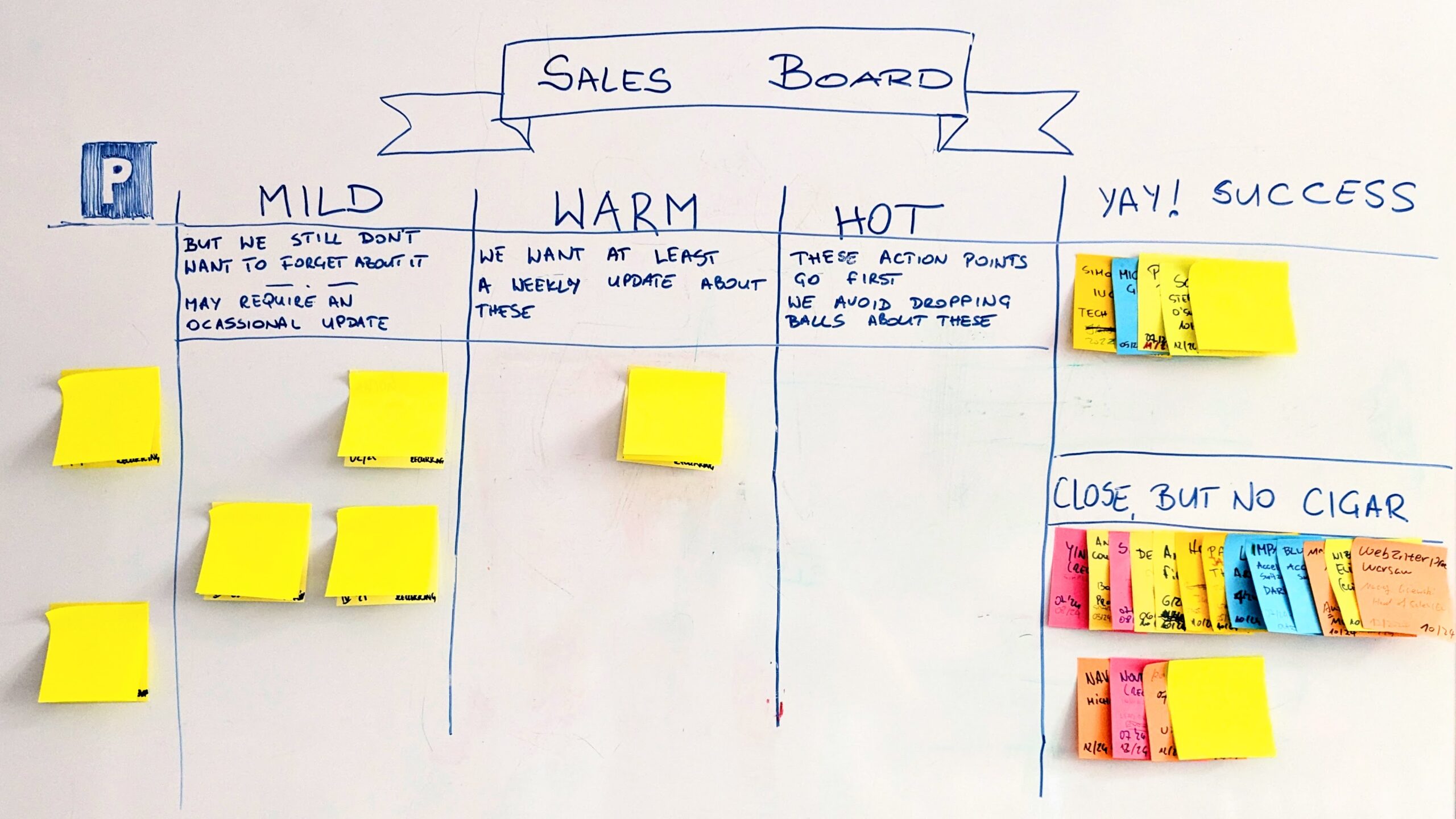
    One of charts that give you a quick overview of what’s happening in a project or product work is Cumulative Flow Diagram (CFD). On one hand in CFD you can find typical information about status of work: how much work is done, ongoing and in backlog, what is the pace of progress, etc. This is the basic stuff. On the other hand, once you understand the chart, it will help you to spot all sorts of issues that a team may be facing. This is where Cumulative Flow Diagram shows its real value.

    Before we move to all the specific cases let me start with the basic stuff though (feel free to scroll down if you’re familiar with this part).

    Cumulative Flow Diagram

    The mechanism of Cumulative Flow Diagram is very simple. On a vertical axis we have a number of tasks. On a horizontal one we have a timeline. The curves are basically a number of items in any possible state shown in a time perspective. The whole trick is that they are shown cumulatively.

    If the green curve shows stuff that is done it will naturally grow over time – that’s simple. If the blue line shows tasks that are in progress, and we have stable amount of work in progress it will still go up as it adds to the green line. In other words work in progress would be represented by the gap between the blue and the green lines… We’ll come back to that in a while.

    Any line on CFD represents a specific stage. In the simplest example we’d have items that are to be done, stuff that is ongoing and things that are done.

    For the sake of the rest of this article I’m going to use a simple process as a reference.

    Workflow

    We have a backlog, items that are in development or testing and stuff that is done. For the sake of Cumulative Flow Diagram examples it doesn’t matter whether tasks in development are ongoing or done and waiting for testing. However, as we will find later, there may be some indicators that would make tracking these two stages separately valuable.

    With such a workflow our Cumulative Flow Diagram may look like this.

    Cumulative Flow Diagram

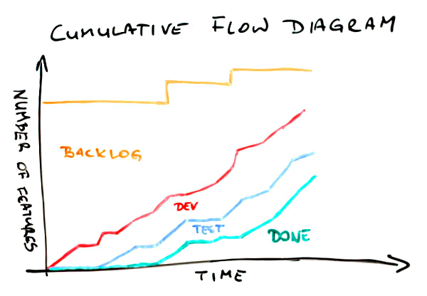
    First, the meaning of the lines. The green one shows how many items have been delivered over time. Everything that is between the blue and the green curves is stuff that is in testing. The area between the red and the blue lines shows how much stuff is in development (either ongoing or done). Finally, the top part below the orange line is the backlog – how many items weren’t yet started.

    In a glimpse we can find a few important bits of information about this project. First, after slow start a pace of delivery is rather stable. Pretty much the same can be said about work that is in progress – the pace is stable and things go rather smoothly. We know that the scope has increased a couple of times, which we can tell looking at jumps of the orange line. Finally, comparing where the green line (done) and the orange line (scope) are on a vertical axis right now we can say that we’re not yet halfway through the project.

    Quite a lot of information for the few seconds, isn’t it? Well, there is more.

    Cumulative Flow Diagram

    On this CFD a few things have been shown explicitly. One is a scope change. We’ve discussed it on the previous chart too. Another one is the space between the red and the green lines. It represents work in progress (WIP). Note, basing on Cumulative Flow Diagram only you can’t learn how much work in progress you have precisely; it is some sort of approximation. Pretty good one, but only approximation. It is a very good indicator how WIP is changing over time though. There also is an arrow labeled “prod. lead time” where “prod.” stands for production. It roughly shows how much time we need to complete an item. Again, it shouldn’t be used as the ultimate lead time indicator but it shows pretty well what lead time we’ve had and how it changes over time. Finally, we can approximate slope of done curve to roughly estimate the delivery time. Of course if the scope changes the delivery time will change as well thus the scope line (the orange one) is also approximated.

    Now, we have even more information. Yay!

    You will rarely see such nice Cumulative Flow Diagrams though. And that’s good news actually. I mean if CFD looks plain and nice all the time you can only learn that much from it. The real CFD magic is revealed when things don’t go so well.

    Let’s go through several typical cases.

    Cumulative Flow Diagram

    In this situation the spread between the red and the green lines is growing over time. It indicates a really bad thing – we have more and more work in progress. That sucks. Increased WIP means increased lead time as well. Not only is time to market longer but also it is more and more difficult to deliver anything fast when we need it.

    That’s not the worst thing. The worst thing is that with increased amount of work in progress we also increase multitasking thus we incur all the costs of context switching making the team less efficient.

    Do we know that for sure? Um… no, not really. I make here an assumption that the team setup hasn’t changed, meaning that we have the same people spending similar amount of time on a project, etc. If it was Cumulative Flow Diagram for a team that is constantly growing and then it would be just OK. The chart may also present an increasing number of blocked tickets which definitely would be a problem but a different one then described above.

    In either case such a situation is a call for more analysis before jumping to conclusions. The potential reasons I offer you with this and following charts are simply the likely ones; not the only available.

    By the way, please treat all the following remarks keeping that in mind.

    One more interesting observation about this Cumulative Flow Diagram is that we have no clues where the root cause for increasing WIP lays. Neither development nor testing part seems to be steadily attached to any other line over time. A further investigation is a must.

    There are charts where we get some clues which stage of a process is problematic.

    Cumulative Flow Diagram

    Whoa, this time the development part compared to the testing part is really heavy. What can we learn from it? We don’t have problems with testing. Also, if a definition of testing is “testing and bug fixing,” which is a typical approach, it doesn’t seem that quality of work is much of an issue either. If we are to point fingers we’d point them to development part, wouldn’t we?

    And we might have been wrong. Of course one thing that may be happening here is a lot of items in development but few of them ready to test. Another issue though may be that there is a lot of stuff waiting for testing but availability of testers is very limited and when they’re available they focus on finishing what they started.

    How can we tell? We can’t unless we have more data. In fact, another line on the chart – one that distinguishes items in “development ongoing” from those in “development done” – would help. Without that the CFD is only an indicator of a problem and a call for a deeper analysis. After all, that’s what Cumulative Flow Diagrams are for.

    Another flavor of a similar issue is on the next CFD.

    Cumulative Flow Diagram

    We can find two things here. Let’s start with the more obvious one – the shape of the green line. It looks like stairs, doesn’t it? Stairs are typical when the last stage, which commonly is some sort of deployment, is done in cadences, e.g. weekly, biweekly, etc. Building on that, a stairs-shaped delivery line mean that work in progress and lead time would vary depending on a moment of release cadence you’re in. Maybe it’s time to make a step toward continuous

    There is one more thing here though. There is pretty significant, and increasing, number of items that are in testing but don’t get released. The gap between the blue and the green line is growing with each consecutive release.

    This one is a real issue here. It may mean that we have a problem with quality and we can hardly reach a state when an item has all the bugs fixed. It may mean that developers simply don’t pay much attention to fixing bugs but tend to start new stuff; at the same testers would follow up on new stories as they wait for bug fixes for the old ones anyway. It may mean that a code base is organized in a way that doesn’t allow releasing everything that is ready. Once again, the root cause is yet to be nailed but at least we know where to start.

    It seems we have more questions than answers. If you think that I’m not helping it will be no different with the next example.

    Cumulative Flow Diagram

    This would happen occasionally in almost every team. All the lines flatten out. What the heck? The first thing I do when I see that is I check for public holidays or company-wide event happening during that time. It may simply be time when no one was actually working on a project and there is a perfect explanation for that.

    Sometimes it is not the case though. This is when things get interesting. If everyone was at work but the chart still indicates that no one got anything done it most likely tells a story about serious problems. A staging environment could have gone down so everyone has been focusing on bringing it back alive. Another project could have needed help and virtually everyone has been sucked there. There could have been a painful blocker that has forced everyone in the team to refocus for a while.

    In either case, whatever it was it seems to be solved already as the team is back on track with their pace.

    Another flavor of such a scenario would look a bit differently. It would give more hints too.

    Cumulative Flow Diagram

    There are two important differences between this and the previous Cumulative Flow Diagrams. One is that, in this case, only two lines flatten out; the development line keeps the healthy progress. The other is that ends of both the green and the blue line are as flat as a table top.

    The latter suggests that whatever is the problem it isn’t solved yet. What the problem might be though? It seems that the team has no problem starting development of new items. They can’t, however, start testing, thus they clearly can’t deliver anything either. One of probable hypothesis would be that there is something seriously wrong with either the testing environment or the testers.

    In the first case it just isn’t technically possible to verify that anything works as intended. In the second it seems something bad happen to our only tester (if there were more than one there would likely be some progress). There is another hint too. Developers don’t seem to care. They just start, and possibly complete, their stuff as if nothing happened.

    I’d say that these guys have to deal first with the issue and then discuss how they collaborate. I sense a deeper problem here.

    The same way as the previous example indicates an issue in the way people cooperate, the next one suggest a quality problem.

    Cumulative Flow Diagram

    Development line goes up in a stable and predictable manner. The testing curve? Not so much. And we better not mention the done line. Obviously we have more and more work in progress here over time – we’ve covered this one before.

    But wait, then suddenly the magic happens and everything goes back on track. At the very end we have decently small amount of work in progress and much stuff delivered. The smell here is how the done (and testing to some point as well) curve skyrockets at the end.

    How come that earlier such pace was impossible? I’d challenge the idea that the team suddenly become so fast. Of course they might have not kept the board up-to-date and then, out of the blue, have realized that they’ve had way more finished items that they’ve thought they had.

    More likely scenario is that under pressure they just deployed whatever seemed at least remotely close to working. If that’s true the problem isn’t solved at all and it’s going to come back to bite them in their butt. A curious reader may try to draw a picture how further part of Cumulative Flow Diagram would look like in this case.

    The next one is one of my favorites. I wonder why it is so far down the list. Oh well…

    Cumulative Flow Diagram

    This Cumulative Flow Diagram is surprisingly common. Let’s try to list a few things that we can find here. The development curve goes up aggressively. Halfway through more than 80% of items are started. Testing doesn’t go nearly that well. And delivery? Well, the start was crappy, I admit, but then it simply went through the roof. And it isn’t only a single day that would suggest delivery of uncompleted stuff. Odds are that these items are properly done. Wouldn’t bet the real money on that but wouldn’t be surprised if that it was so either.

    Of course we have very high WIP in the middle of this CFD but at both ends the gap seems to be significantly smaller.

    Ah, one more thing. It seems that at the end of the day we’ve delivered everything that was in the backlog. Yay!

    Now, what would be the diagnosis in this case? Time boxing! This is one of classic visualizations of what typically happens over the course of an iteration. If a team is comfortable with planning and has rather stable velocity it’s likely that they’d fill backlog with reasonable amount of new features.

    Then, given no WIP limits within the time box everyone does their own thing: developers quickly start many features having no pressure other than the end of the iteration to finish stuff. Eventually, the backlog is cleared so the team refocuses to finish stuff, thus the acceleration at the latter stages of the process.

    If you pictured a series of such Cumulative Flow Diagrams attached one to another you’d see a nice chain going North-East. You’d find many of these in Scrum teams.

    Another chart, despite some similarities to the previous two, suggests a different issue.

    Cumulative Flow Diagram

    In this case almost everything looks fine. Almost, as the done line barely moves above the horizontal axis. However, when it finally moves it goes really high though. What does it mean?

    My guess would be that the team might have been ready with the stuff but, for whatever reasons, they wouldn’t deliver. In fact this is one of typical patterns in fixed price, fixed date projects, especially in bigger ones. Sometimes a basic measure that is tracked is how many items are done by the production team. No one pays attention whether it can possibly be deployed in production or even staging environment.

    Eventually, it all gets deployed. Somehow. The deployment part is long, painful and frustrating though. Cumulative Flow Diagram representation of that pain and tears would be that huge narrow step of the done curve.

    Talking about huge and narrow steps…

    Cumulative Flow Diagram

    Another chart has such a step too. We’ve already covered its meaning at the very beginning – it is the change of the scope. In this case it is not about the fact that such change has happened but about its scale and timing.

    First, the change is huge. It seems to be more than a half of initial scope added on the top of it. Second, it happens out of the sudden and pretty late in the project. We might have been planning the end date and now, surprise, surprise, we barely are halfway through again.

    Now, this doesn’t have to be a dysfunction. If you were talking with the client about the change or it is simply a representation of expected backlog replenishment that’s perfectly fine. In either case you it shouldn’t come as a surprise.

    If it does, well, that’s a different story. First, if you happen to work on fixed prices contract… man, you’re screwed up big time. It isn’t even scope creep. Your scope has just got on steroids and beaten world record in sprint. That hurts. Second, no matter the case you likely planned something for these people. The problem is it’s not going to happen as they have hell lot of work to do in the old project, sorry.

    So far lines on Cumulative Flow Diagrams were going only up or, at worst, were flat. After all, you’d expect that given the mechanism of creating the chart. That’s the theory. In reality a following chart shouldn’t be that much of a surprise for you.

    Cumulative Flow Diagram

    Whoa! What happened here? A number of stories in testing went down. The red line representing stuff in development followed but don’t be fooled. Since the gap between the red and the blue line is stable nothing really happened to the items in development; it’s only stuff in testing that was affected.

    Now, where did it go? Definitely not to done bucket – the green line didn’t move. It didn’t disappear either as the total number of items (the orange line) seems to be stable. A few items had to go from testing to backlog then.

    What could it mean? Without an investigation it’s hard to say. I have good news though. The investigation shouldn’t be long – such things don’t happen every other day. For whatever reasons stuff that was supposed to go past code complete milestone was marked as not started.

    I sense a major architectural or functional change. What’s more, it’s quite probable that the change was triggered by the tests of aforementioned items. Unfortunately it also means that we’ve wasted quite some time building wrong stuff.

    Another flavor of that problem looks a bit scarier.

    Cumulative Flow Diagram

    Again, the total scope didn’t change. On the other end every other line took a nosedive. Once again amount of stuff in development doesn’t seem to be affected. This time the same can be said about items in testing. It’s the delivered stuff that got back to the square one.

    It means that something that we though was done wasn’t so. One thing is that we were building wrong stuff, exactly as in the previous example, only we discovered it later. We likely pay the order of magnitude bigger price for the late discovery.

    There’s more in it though. This Cumulative Flow Diagram shows that we likely have problems with acceptance criteria and / or collaboration with a client. I mean how come that something that was good is not so anymore? Either someone accepted that without checking or we simply don’t talk to each other. No matter the case it sucks big time.

    Would the orange line never move down then? Oh yes, it would.

    Cumulative Flow Diagram

    I mean, besides an obvious case where a few items are removed from backlog and the only line that moves down would be the orange one, we may find this case. Using the technique perfected in the previous examples we will quickly find that a few items that were in testing are… um, where they are actually?

    Nowhere. They’ve disappeared. They haven’t been completed, they haven’t been moved back. These items are no more.

    What does it mean? First, one more time we’ve been working on wrong stuff (fools we are). Second, we’ve figured it out pretty late (but could have been later). Third, the stuff doesn’t seem to be useful at all anymore.

    It’s likely that we realized that we don’t know how exactly build this or that and we asked the client just to learn that they don’t need either of those anymore. It’s also likely that we’ve encountered a major technical issue and rethought how we tackle the scope possibly simplifying the whole approach. Whatever it was, if we had figured it out earlier it wouldn’t have been so costly.

    Finally, one more Cumulative Flow Diagram I want to share with you.

    Cumulative Flow Diagram

    Think for a while what’s wrong with this one.

    When compared to the previous charts it seems pretty fine. However, by now you should be able to say something about this one too.

    OK, I won’t keep you in suspense. In the first part of this CFD work in progress was slowly but stably growing. However, it seems that someone noticed that and the team stopped starting new stuff. You can tell that seeing how relatively flat the red line has become somewhere in the middle of the chart.

    Given some time testing and delivery, even though their pace hasn’t changed, caught up. Work in progress is kept at bay again and the team’s efficiency is likely improved.

    As you can see, despite past several examples, you can see the effects on improvements at Cumulative Flow Diagrams too. It’s just that CFD is more interesting in terms of learning that you have a problem than finding confirmation that you’ve solved it. The latter will likely be pretty obvious anyway.

    Congratulations! You made it through to what is probably the longest article in the history of this blog. Hopefully you now understand how to read Cumulative Flow Diagrams and what it may indicate.

    I have bad news for you though. You will rarely, if ever, see such nice CFDs as shown in the examples. Most likely you will see an overlapping combination of at least a few patterns. This will likely make all the lines look like they were tracing a rollercoaster wagon.

    Fear not. Once you get what may be happening under the hood of the chart you will quickly come up with the good ideas and the right places to start you investigation. After all, Cumulative Flow Diagram will only suggest you a problem. Tracking it down and finding an antidote is a completely different story.

    However, if you’re looking for a nice health-o-meter for your team Cumulative Flow Diagram is a natural choice.

  • WIP Limits by Conversation

    The biggest challenge when applying Kanban on portfolio level is how to introduce WIP limits. Kanban without limiting work in progress will always be shallow. In fact, many would argue (me included) that it is not Kanban at all.

    The problem is that typical methods we use to limit work in progress on a portfolio level simply don’t work. Well, of course you can try to limit the number of concurrent projects, but if you’re like a vast majority of companies your projects will vary in their size very, very much. I find 1:200 difference in size between the smallest and the biggest project run by an organization pretty common.

    If we wanted to translate this to work we do on a team level we would be talking about having tasks that we finish in anything between half a day and half a year.

    It means that you could substitute one of your big ongoing projects with a dozen concurrent small ones and that’s still fine. Except that using a number of projects as a WIP limit doesn’t seem like a good idea anymore.

    Limiting work in progress in such an environment has to be contextual. One has to take into consideration size and length of projects, dependencies between them, etc. A different WIP limits will be applicable when portfolio is dominated by medium-to-big endeavors and different will make sense when you’re coping mainly with small projects. In short, to say anything more about sensible WIP limits we have to know the context.

    If we discuss the current context, everything that is happening right now, estimated effort needed to complete the new project, available and required capabilities and any other potential projects we can likely say whether we should or should not start the project. This is basically the core of idea called WIP limits by conversation (I credit Klaus Leopold who I learn the term from). With each new project in a backlog we discuss to say whether it fits the implicit WIP limits or not.

    It may sound like it’s a lot of work but it isn’t. The most difficult discussions will be around relatively big projects but then, you don’t start such projects every other week, do you? Discussions about small projects may be more frequent but they will be way easier to decide on too. And they won’t be happening so very often either.

    A tool that is very handy to support WIP limits by conversation is good visualization. Unless everyone involved has a general idea which teams work on what, what capabilities free teams can offer, what are other commitments, etc. the discussion will be basing on gut feelings. And a gut feel of most CEOs is that the company will cope with every single project… somehow. This is how you end up having 30 people involved in 100+ projects. Not the most effective way of working, right?

    I am perfectly aware that the approach seems to be vague, but the general rule is that the more variable the work is the less explicit WIP limits can be.

    WIP limits by conversation may also seem fragile. If there is a person who pushes more and more projects into the system lack of explicit rules for limiting work in progress may seem like a weakness. Not necessarily so. Usually visualization is enough to show risks attached to a project that doesn’t fit available capabilities. After all, no wants to start a project that is doomed for failure and will hurt the organization’s reputation.

    Of course the conclusion of discussion may be that not starting the project is not an option because of, e.g. relationship with the customer, but then you simply start talking about costs. What other work won’t be done or will be delayed, etc. A format of conversation proves to be very useful on such occasions.

    One nice side effect of introducing WIP limits by conversation is that you are encouraged to talk about thing like expected value, cost of delay, estimated effort and probabilities of all of these numbers for all the projects that you start. It usually helps to refrain from projects that don’t make much sense but unless you’d started asking such questions no one would have been aware of the fact.

    Another gain is slack time generated on a team level. If you care about not overloading the teams, occasionally they won’t have an ongoing project. This is perfect moment to all sorts of improvement work as well as learning or helping other teams.

    My experience is that, despite its vague nature, limiting WIP by conversation works surprisingly well. After all, I don’t know many people that want to make their teams miserable and hurt their organization on purpose.

  • Happiness Chart

    Given the fact that my most recent project is done for the client that lives in a galaxy far, far away (OK, just on the other end of Europe) an electronic Kanban / task board is a default. And yes, this means my heart bleeds as I’m an uncritical whiteboard lover.

    It means that we’ve had a full whiteboard to use for different stuff and, as you may guess, it didn’t stay clear.

    The big part of it is used for a happiness chart. The concept is very simple: everyone, at some point of every day, draws a happy / neutral / sad face in their row. The face refers to our general attitude toward the project during that day.

    Happiness Chart

    A typical question is how strictly we should treat “toward the project” part. Should issues unrelated to the project, or work in general, affect what we put in the happiness chart?

    Hell, yes! Unless you are a robot and can fully isolate your private and professional lives. Interestingly enough, I know people who forget about their work in the very second they leave their workplace but I don’t know any that forget about their homes, families and friends when they enter it.

    Now, should we fill the happiness chart at the beginning or at the end of a day?

    Hell… um… it depends. We decided to do it at the beginning of the day or, more precisely, just after standup. This way we may consider it more a leading indicator than a lagging indicator. When a day has been good we likely see progress anyway. However, I would say that both approaches may work well. After all, you don’t look at the happiness chart in the context of a single day.

    OK, fine, it seems funny but what can you learn from such a fuzzy tool?

    A series of average-to-low moods from one person is an indicator that something is happening, either at work or outside. Either way a subtle inquiry may reveal a root cause and maybe open a couple of options of helping. If nothing else it gives you better understanding why someone is below their best.

    By the way, one could say that if you all sit in the same room you will simply see this. Well, good luck with that. I’ve seen too many frustrated introverts, who look exactly the same as um… enthusiastic introverts. I’ve met too many very expressive extroverts, who seem to change their mood and attitude faster than you can track it. I don’t believe in “you will see it coming” any more.

    By the same token you might understand better than one’s whining attitude is more of a pose than a real thing.

    Another thing is looking for patterns. A complete set of low mood faces from the team simply yells “screw up, big time!” Something definitely went wrong. You may know it anyway but don’t take it for granted. In either case that’s definitely a call for help.

    Especially happy set of faces tells a story about a major accomplishment even if it isn’t reflected at a task board. It might have been an especially painful blocker that’s just gone away or a risk that has been mitigated, etc.

    Then, if you pay attention, you learn hell lot about what annoys people. Issues with video conferencing stuff, client’s presence at standup, scope being changed back and forth or what have you. You will hear such things being thrown into the air when people fill the happiness chart.

    Given that you use happiness chart that looks a bit like calendar it also works great as planning tool. People can fill their planned days off. You can easily mark when the next retrospective happens, etc.

    Finally, it’s fun to use it. The very first change that the team proposed was freedom in terms of what exactly is drawn on the board. The decisive thing is the color used (red for unhappy, blue for average, green for happy) but the picture may be pretty much whatever. After a week we’ve already had a devil, an angel, a Moomin (OK, it’s Groke), a pirate, a guy in a top hat, a giraffe, a cat… you already get it, right?

    Our happiness chart became way more than simply a place where we mindlessly draw emoticons. It actually improves our moods a bit on the top of everything else I mentioned above.

    By the way, it you want to play a little game look at the chart below. It describes average mood of the team (only people present on any given day). The possible results are anything between 100% (everyone was happy) and -100% (everyone was unhappy). Now, guess what might have been happening in the project and what kind of progress we were making.

    Happiness Chart

  • Portfolio Kanban: Why Should I Care?

    It’s an interesting observation for me: people keep asking me to speak about Portfolio Kanban. London, Krakow, Chicago… it seems that for me Portfolio Kanban is going to be the topic to speak about this year.

    When I started with Portfolio Kanban it was an experiment – a tool I wanted to play with to see whether it is useful at all. When you start speaking publicly about such things though, there is one important question you have to answer: why should anyone care?

    After all, unless the question is answered Portfolio Kanban is just a toy.

    So… why?

    When I look at work that is happening in lean and agile communities I see a lot happening on a team level. Scrum is a framework designed for a team level. When you look at Kanban implementations, vast majority of them are on the same level too. Now, should we be worried? Is it wrong? No! It’s perfectly OK. Well, sort of.

    Let me start with this:

    A system of local optima is not an optimal system at all; it is a very suboptimal system

    Eli Goldratt

    Focusing on a team level and a team level only we are optimizing parts as rarely a single team is a whole. I’m far from the orthodox view that we should focus on optimizing the whole and the whole only, as most of us don’t have enough influence to work on such a level.

    It doesn’t mean though that we should cease any responsibility for optimizing the whole system, no matter what sphere of influence we have.

    This is basically why improvements on a portfolio level are so crucial. They don’t have to be done instead of improvements of a team level or prior to them. In fact, a holistic approach is probably the best option.

    If you aim your efforts on a team level only you likely become more efficient, but the question is: efficient at building what?

    Processing the waste more effectively is cheaper, neater, faster waste.

    Stephen Parry

    If the wrong decisions are made on a portfolio level, efficiency on a team level doesn’t really help. What’s more, it can even be harmful because we just produce waste more efficiently. I can think about a number of wasteful activities imposed on teams on a portfolio level, but two are the biggest pains in the neck.

    One is starting projects or products that shouldn’t be started at all in the first place. There is dumb notion that people shouldn’t be idle, so whenever individuals or teams have some spare time it is tightly filled with all sorts of crazy ideas that simply aim at keeping people 100% utilized. That’s just plain stupid.

    Usually, even when people are busy, they get this kind of work anyway, as “they will cope with that somehow.” After some time not only do we run lots of projects or initiatives of questionable value but we have to spend additional effort to finish and maintain them.

    Another pain point is multitasking. All these filler projects are obviously of lower priority than regular work. So what people end up with is they keep switching between projects whenever higher priority tasks calls. The problem is that a context switch between two projects is even more painful than a context switch between two similar tasks within the same general context. Oh, and have I already mentioned that once you’ve finished those filler projects you keep switching back to them to do maintenance?

    So basically what you get is very low value work at cost of huge context switching tax. Congratulations!

    Oh, is it that bad? It’s even worse.

    If you are doing the wrong thing you can’t learn, you will only be trying to do the wrong thing righter.

    John Seddon

    If the organization starts all the fires on a portfolio level, teams end up trying to cope with that mess. If they care, they will make the wrong thing a bit better. Does it help? Not at all. The sad thing is realization what could have been happening instead, which is basically learning.

    The organization could have been learning what work really adds value. The teams could have been learning how to work better. On all levels there would have been opportunities to improve thanks to occasional slack time.

    And, by the way, the organization would have been operating more efficiently too, thanks to less context switching.

    This is basically why you should focus more on organizing your project / product portfolio.

    Why Kanban in this application then?

    I guess I already gave the answer between lines. Visualization, as always, enables harvesting low-hanging fruits. I mean, unless we see how screwed up we are, we often don’t even realize the fact. Visualization also helps to substitute everyday project-related wild-ass guesses with everyday project-related informed decisions. Sounds better, doesn’t it?

    Then there are WIP limits that enable conversations about what projects get started, how we staff the teams and how we react in all sorts of special case situations. In fact, without that bit changes introduced by Portfolio Kanban will be rather shallow.

    Finally, if you are aiming for improvements, Portfolio Kanban gives you a change mechanism that is very similar to what you know from team level Kanban implementations.

    The best part though, is how easily you can start your journey with Portfolio Kanban. Even though it tackles the part of the organization that is usually highly formalized and full of politics, Portfolio Kanban doesn’t require, at least at the beginning, to have everyone signed up for the idea. A single person can use Portfolio Kanban as a disruptive weapon and see what it brings.

    Seriously, it’s enough to have only one person willing to work consistently on Portfolio Kanban board to see the first yield of the improvements. And one doesn’t have to wait very long until the first meaningful discussions around projects start. Then you know something has already changed.

    Even when no one really realized you used Kanban to achieve that.

    If you liked the article you may like my Portfolio Kanban Story too.

  • Why Burn-up Chart Is Better Than Burn-down Chart

    The other day I was in the middle of discussion about visuals a team was going to use in a new project. When we came to the point of tracking completion of the project I advised a burn-up chart and intended to move on. The thing that stopped me was the question I was asked: why burn-up and not burn-down?

    Burn-down Chart

    First, some basics. Burn-down chart is an old idea I’ve learnt from Scrum. It is a simple graph showing amount of work on a vertical and timeline on a horizontal axis. As time progresses we keep track how much work is still not done. The goal is to hit the ground. The steepness of the curve can help us approximate when it’s going to happen or, in other words, when we’re going to be done with the whole work.

    When we think about quantifying work it should be anything we use anyway – story points, weighted T-shirt sizes, simple number of tasks or what have you.

    Burn-up Chart

    Burn-up chart’s mechanics is basically the same. The only difference is that instead of tracking how much work is left to be done, we track how much work we’ve completed, so the curve is going up, not down.

    The Difference

    OK, considering these two work almost identically, what’s the difference? Personally, I don’t buy all the crap like “associations of the word burn-down are bad.” We learned not to be afraid of failure and we can’t deal with a simple word? Give me a break.

    The real difference is visible when the scope changes. If we suddenly realize we have more work to do burn-down may look like this.

    Unfortunately, it can also look differently if we happen to be (un)lucky enough to complete some work at the same time when we learn about additional work.

    It becomes even trickier when the scope decreases.

    Have we just completed something or has a client cancelled that feature which we talked about yesterday? Not to mention that approximating the finish of work becomes more difficult.

    At the same time, burn-up chart makes it all perfectly visible as progress is tracked independently on scope change.

    You can see scope changes in both directions, as well as real progress. And this is exactly why choosing burn-up over burn-down should be no brainer.

  • Radar Charts and Maturity of Kanban Implementations

    One of outcomes of Hakan Forss’ session on depth of Kanban practices at the Kanban Leadership Retreat was the use of radar charts to show the maturity of a Kanban implementation. The whole discussion started with the realization that different teams adopt Kanban practices in different orders, thus we need a tool to assess them somehow.

    Radar charts, or spider charts, seem to be good tools for visualizing how well a team is doing. However, when you start using them, interesting things pop up.

    Coming Up with Results

    First, how exactly do you tell how mature an adoption of a specific practice is? How far are we on a scale from 0 to 5 with visualization? Why? What about limiting work in progress? Etc.

    One of my teams decided to describe 0 as “doing nothing” and max as “where we think we would like to be.” With such an approach, a radar chart can be treated as a motivational poster – it shows exactly how much we still should do with our Kanban implementation. It also means that the team aims at a moving target – as time passes they will likely improve and thus set more ambitious goals.

    There is also a drawback to this approach. Such an assessment is very subjective and very prone to gaps in knowledge. If I think that everything there is to be done about WIP limits is to set those numbers in each column on the board and avoid violating them, I will easily hit the max on the “limiting WIP” axis. Then of course I’ll award myself the Optimist of the Week and Ignorant of the Month prizes, but that’s another story.

    On a side note: I pretty much expect that someone is going to come up with some kind of a poll with a bunch of questions that do the job for you and tell you how far you are with each practice. And, similarly to the Nokia Test, I think it will be a very mixed blessing with negatives outweighing positives.

    Finding Common Results

    The second issue is about gathering collective knowledge from a team. People will likely differ in their judgment – one would say that visualization is really mature, while the other will state that there’s lot more to be done in there.

    The obvious strategy is to discuss the areas where the differences are the biggest. However, it’s not a fancy flavor of planning poker so, for heaven’s sake, don’t try to make everyone agree on the same number. It is subjective after all.

    One more interesting trick that can be done is putting all the results on a single radar chart with min and max values creating the borders of an area. This area will tell you how your Kanban implementation is perceived.

    With such a graph not only do you want to have this bagel spread as far as possible but also to have it as thin as possible. The latter may be even a more important goal in closer perspective as a wide spread of results means that team members understand the tool they use very differently.

    Comparing Results between Teams

    The third issue pops up when you compare graphs created by different teams. Let’s assume you have both issues above solved already and you have some kind of consistent way of judging maturity of Kanban practices. It is still very likely that different teams will follow different paths to Kanban adoption, thus their charts will differ. After all this is what launched the whole discussion in the first place.

    It means, however, that you may draw very interesting conclusions from comparing the results of different teams. You don’t try to say which team is better and which needs more work. You actually launch discussions on how people are doing things and why they think they are good (or bad) at them. You enable collaborative learning.

    As a bonus you can see patterns on a higher level. For example, people across the organization are doing pretty well with visualization, have very mixed outcomes in terms of managing flow and are not that good when it comes to limiting WIP. It can help you focus on specific areas with your coaching and training effort.

    Besides, it is funny to see how a personal kanban maturity radar chart can look like.

    To summarize, radar charts are nice visuals to show you where you are with your Kanban adoption, but they may, and should, be used as a communication enabler and a learning catalyst.